Performance Diagnostics
How do you know when your machine learning model is working? How can you make it work better?
After your model is ingested, put Truera to work helping you identify performance issues by running a suite of TruEra- and user-defined tests on the model. The next step is to fix any issues surfaced by/in the test results. Necessary actions regarding the data could entail dropping, adding, and/or transforming certain features, as well as adding, removing or resampling outlier data points. Other actions could involve the model itself — implementing refinements like hyper parameter tuning, changing model type/architecture, ensembles, and so forth.
TruEra's Performance Diagnostics tools provide important analyses about your model's performance on each selected data split — its accuracy, score distribution, ROC-AUC curve, precision-recall curve, and more — to let you:
- Explore – visualizations that help you quickly spot trends leading to valuable insights about your model and data.
- Focus – zeroing in on error hotspots.
- Debug – with tools that help you identify which features or points are the potential reasons for the dip in model performance.
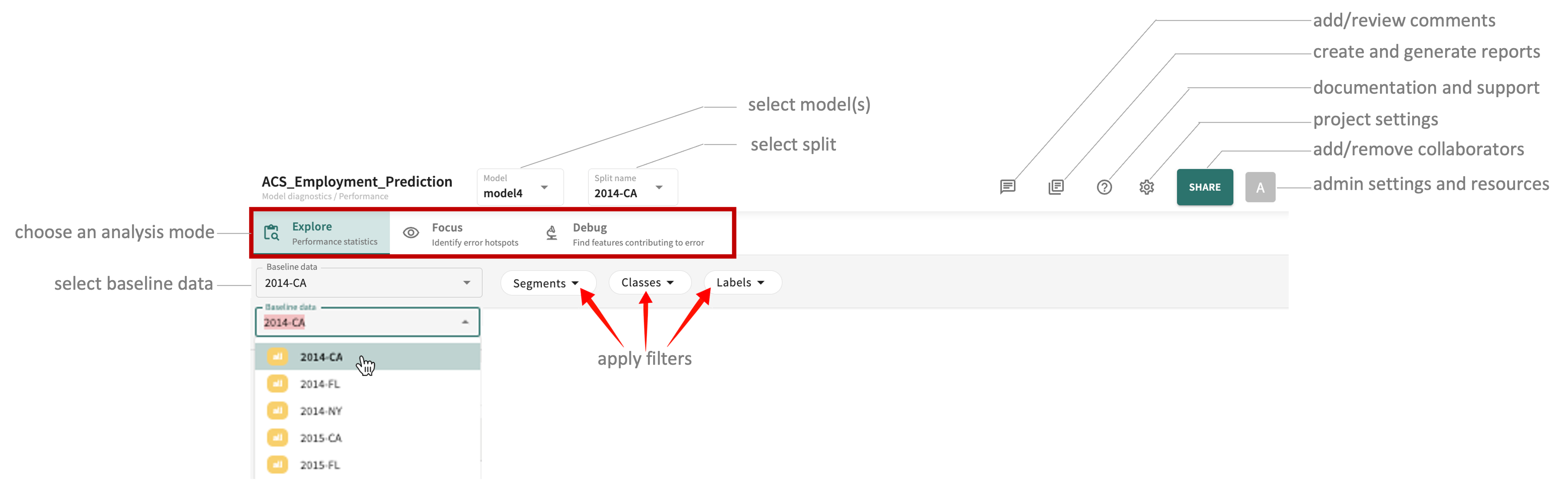
As pictured above, click one of the three tabs — Explore, Focus, or Debug — to access the results of the respective mode for the select model(s) and data.
Note
Only the Explore tab is currently supported for Ranking-type projects.
Exploring Model Performance Statistics
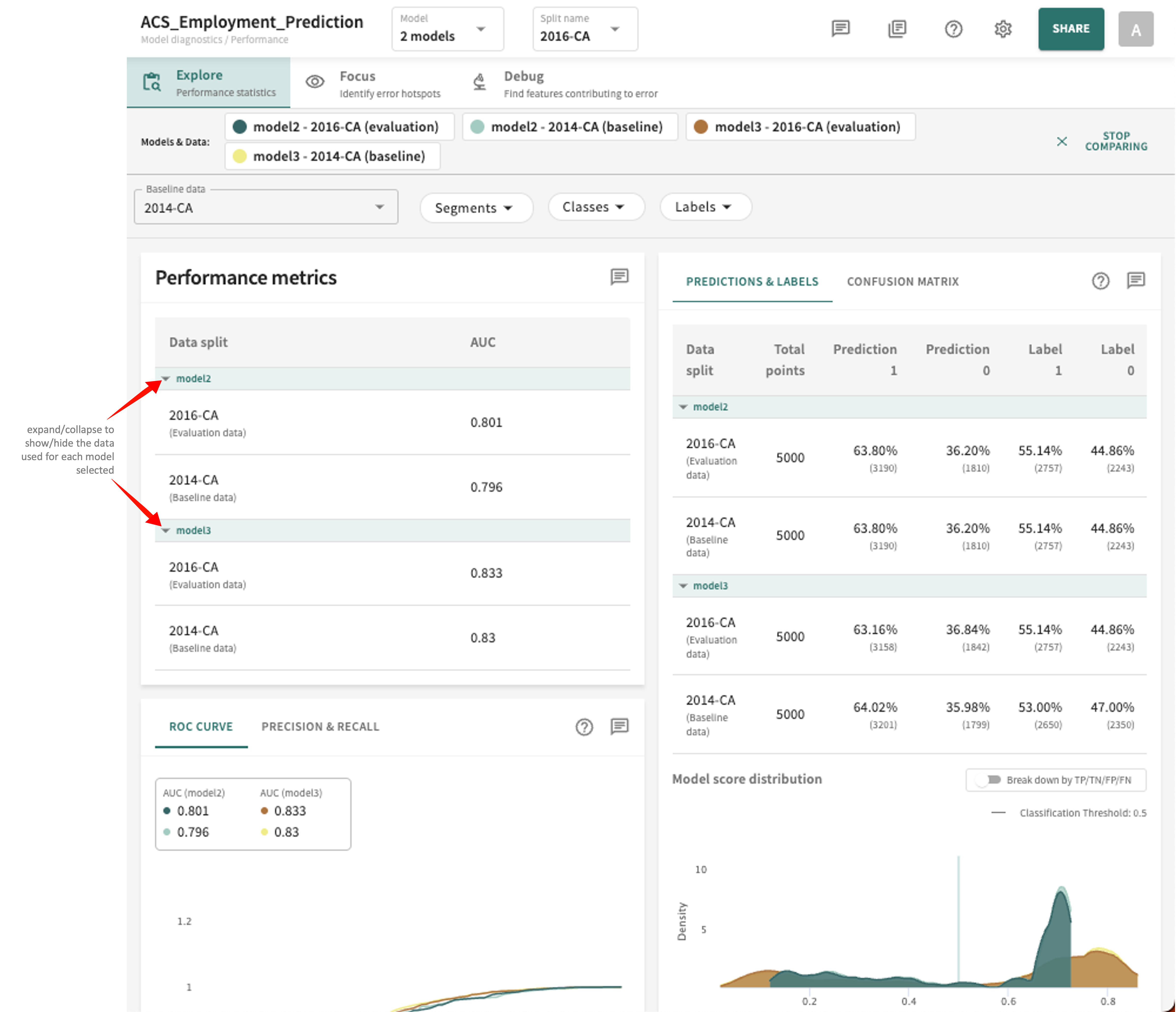
Click the Explore tab and you'll see the currently computed performance statistics for the selected model(s) arranged into three panels showing the scores and plots for AUC, ROC CURVE, PRECISION & RECALL, PREDICTIONS & LABELS, and CONFUSION MATRIX.
Guidance related to each respective panel and controls is covered below. First, however, you'll need to select which of your ingested models and data you want to examine.
Model and Split Selection
You can select one or more of the available models and splits in your project to assess and compare performance.
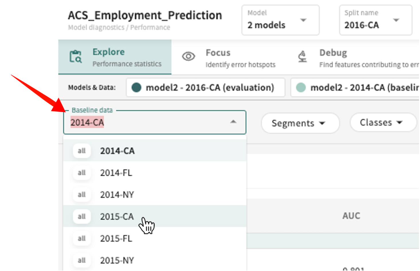
To choose a Baseline data split to compare against:
Click the Baseline data listbox and select the desired split from the list.
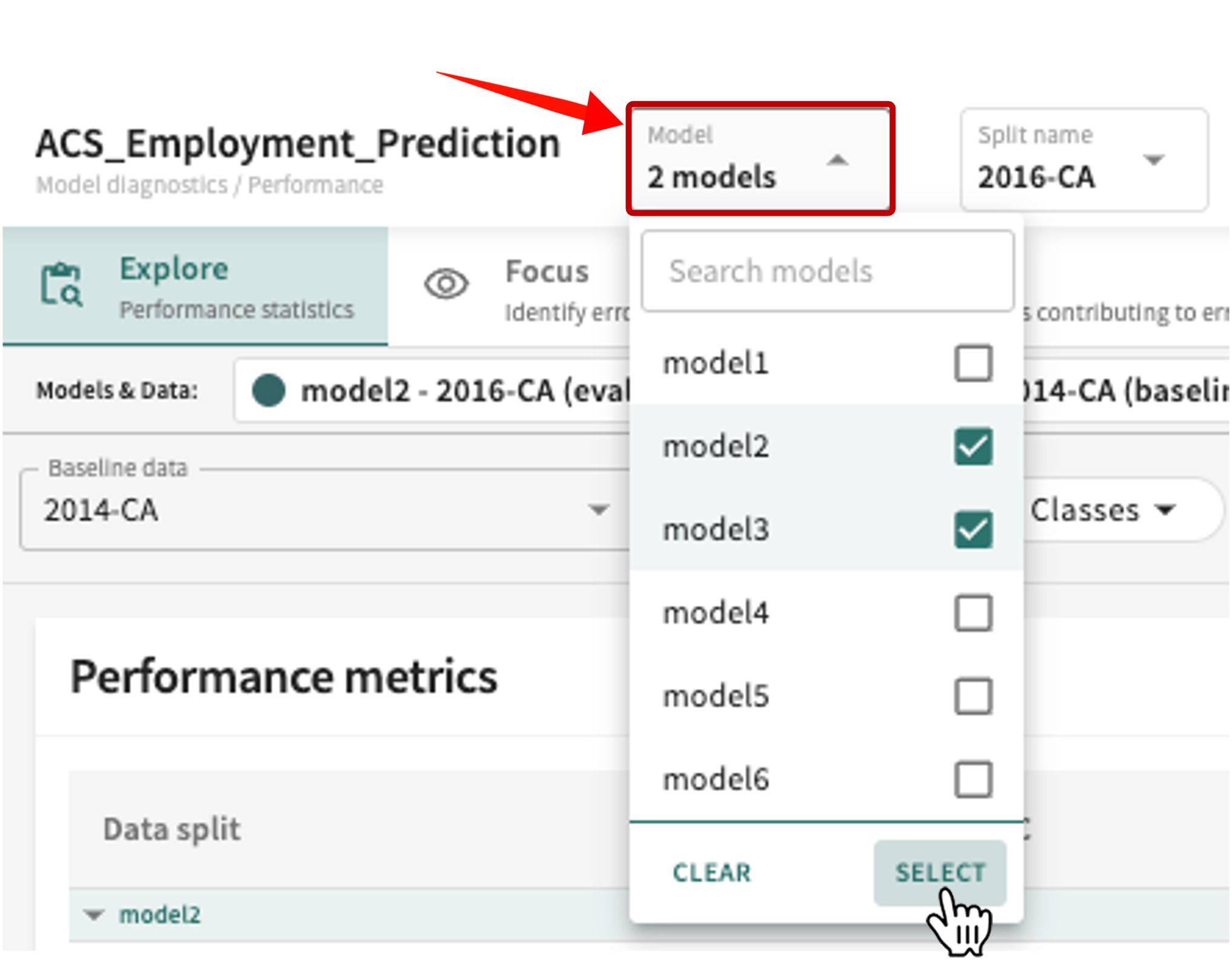
To change the model(s) under examination:
-
Click the Model selector above the content panel.
-
Click the checkbox of currently selected models to deselect them.
-
Click the checkbox of different/additional models in the list to choose them, then click SELECT (or click CLEAR to reset your selection).
To change the data split to evaluate:
Click the Split name listbox and select from the list. If the number of ingested splits is extensive, you can enter a partial or full split name string in the Search data splits textbox to reduce the list of choices.
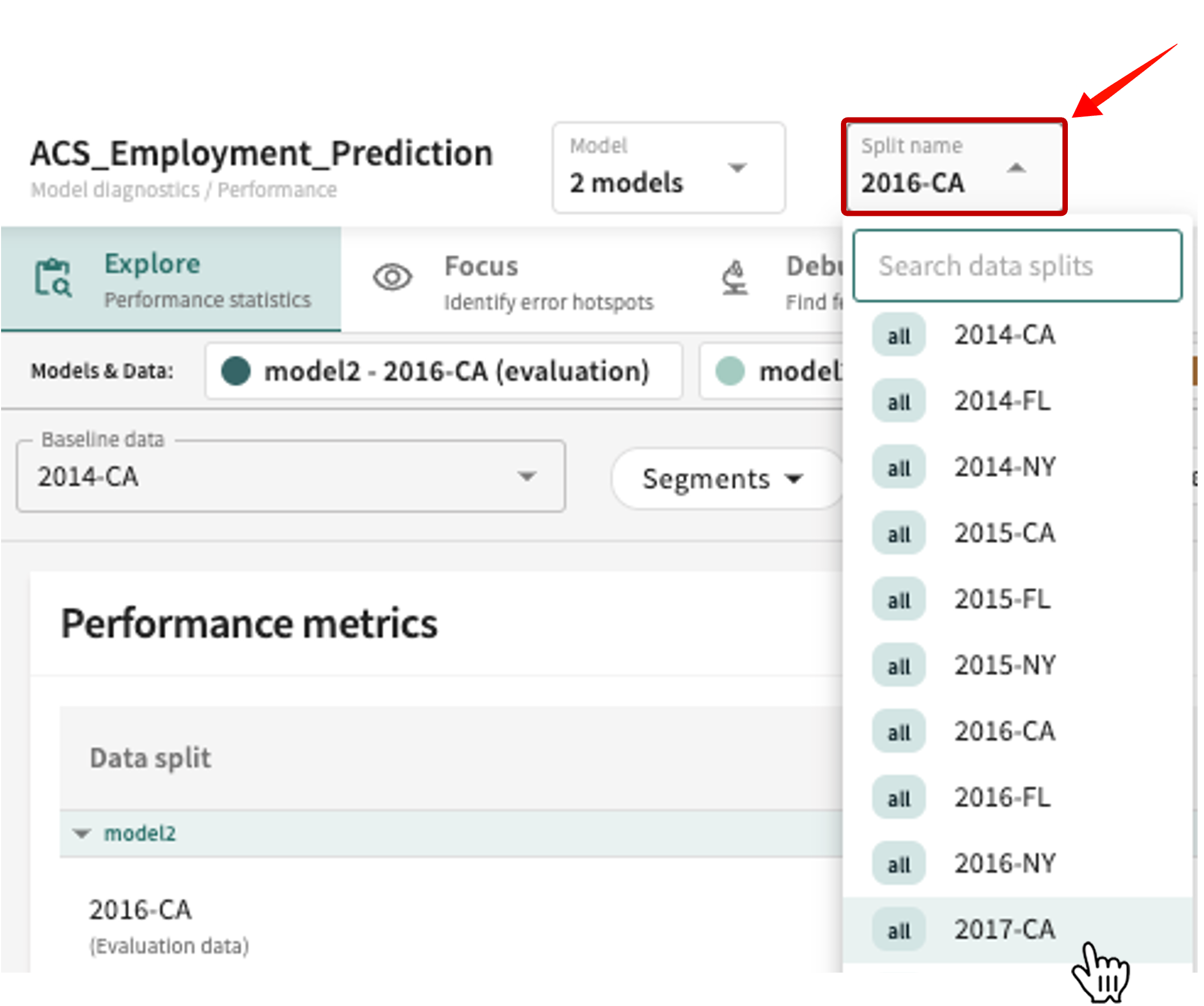
Heads-up
The selected split may not be shared by all selected models.
Your selections are now listed in the Model & Data panel. If you selected more than one model, each is listed horizontally showing it paired with the evaluation split, as well as the baseline.
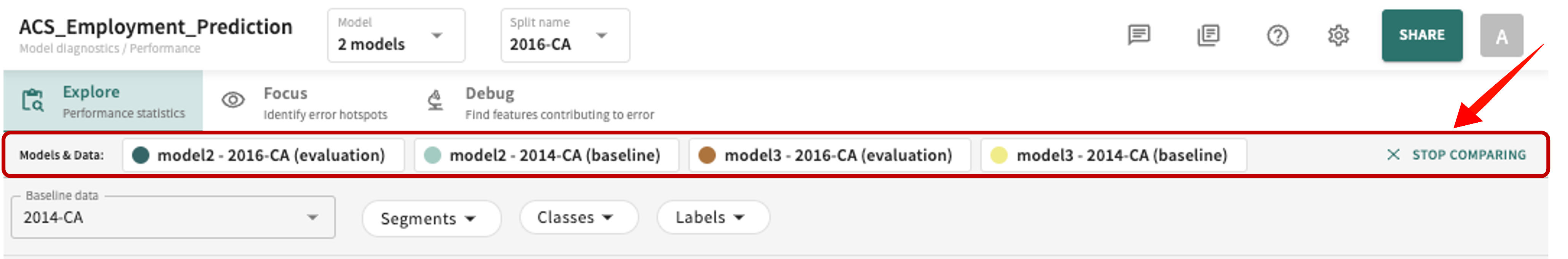
Clear/reset the model comparison by clicking X STOP COMPARING.
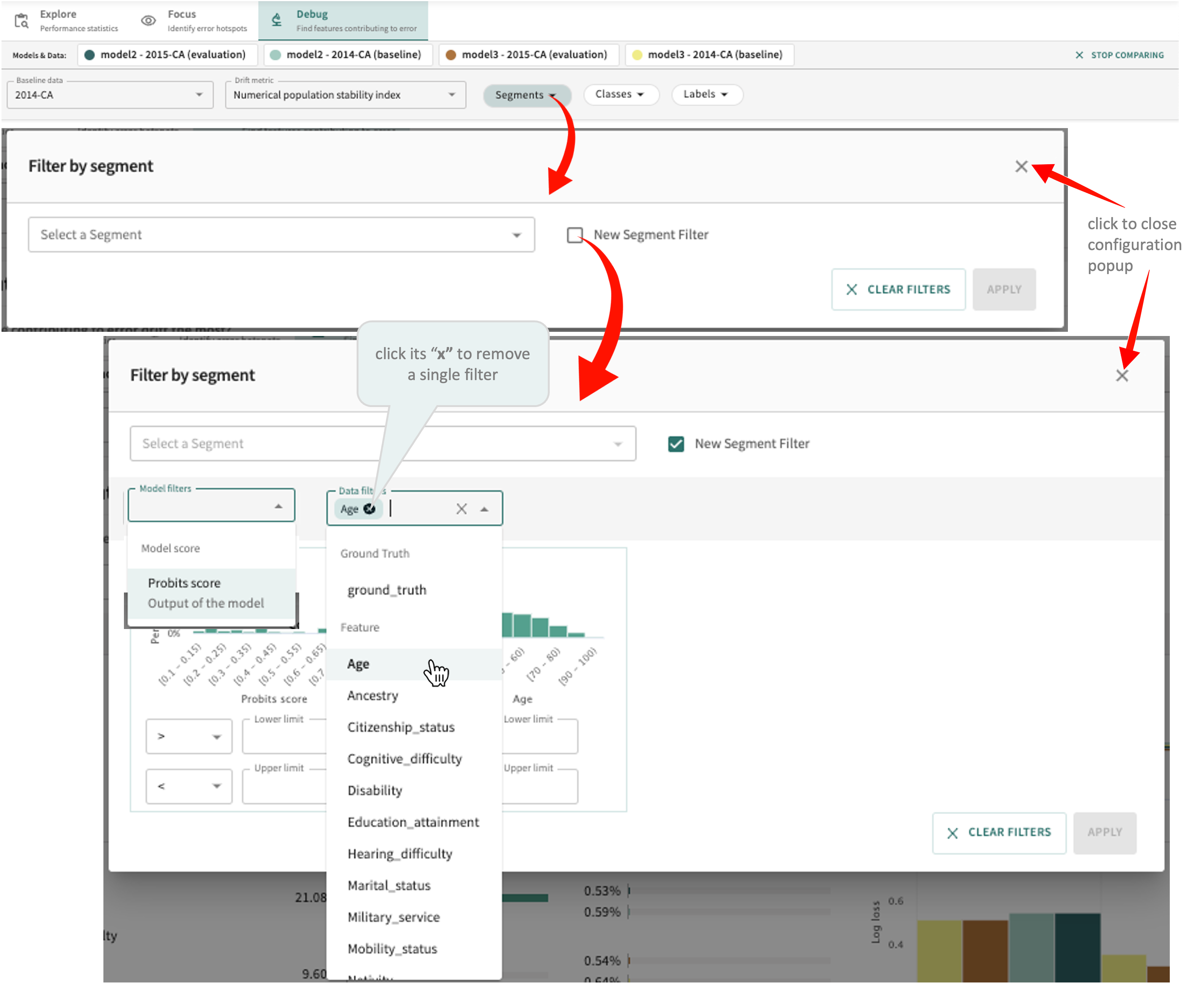
- Click the Segments filter selector.
- Select one or more existing segments or create a New Segment Filter.
Note: New segment filters must specify a value or range and can be can be (a) Ground Truth, (b) a Feature, or (c) an Excluded feature.
- Click the "x" for an individual filter to remove that filter only.
- Click APPLY to confirm your selections or click CLEAR FILTERS to remove all filters.
Once you've set the attributes above, the results are displayed accordingly, as discussed next.
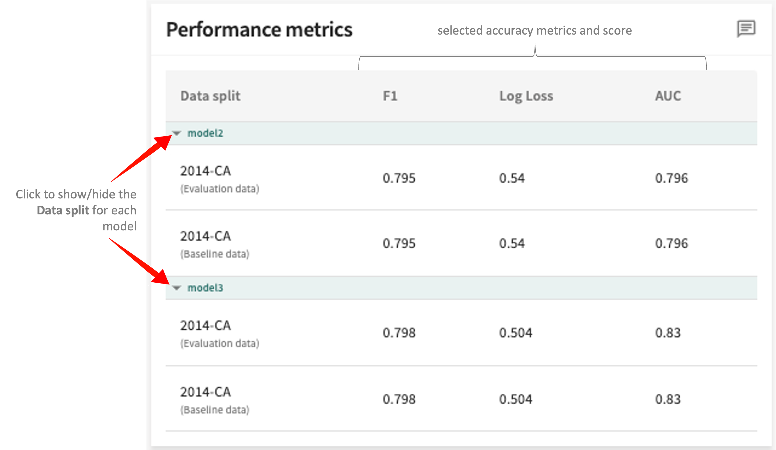
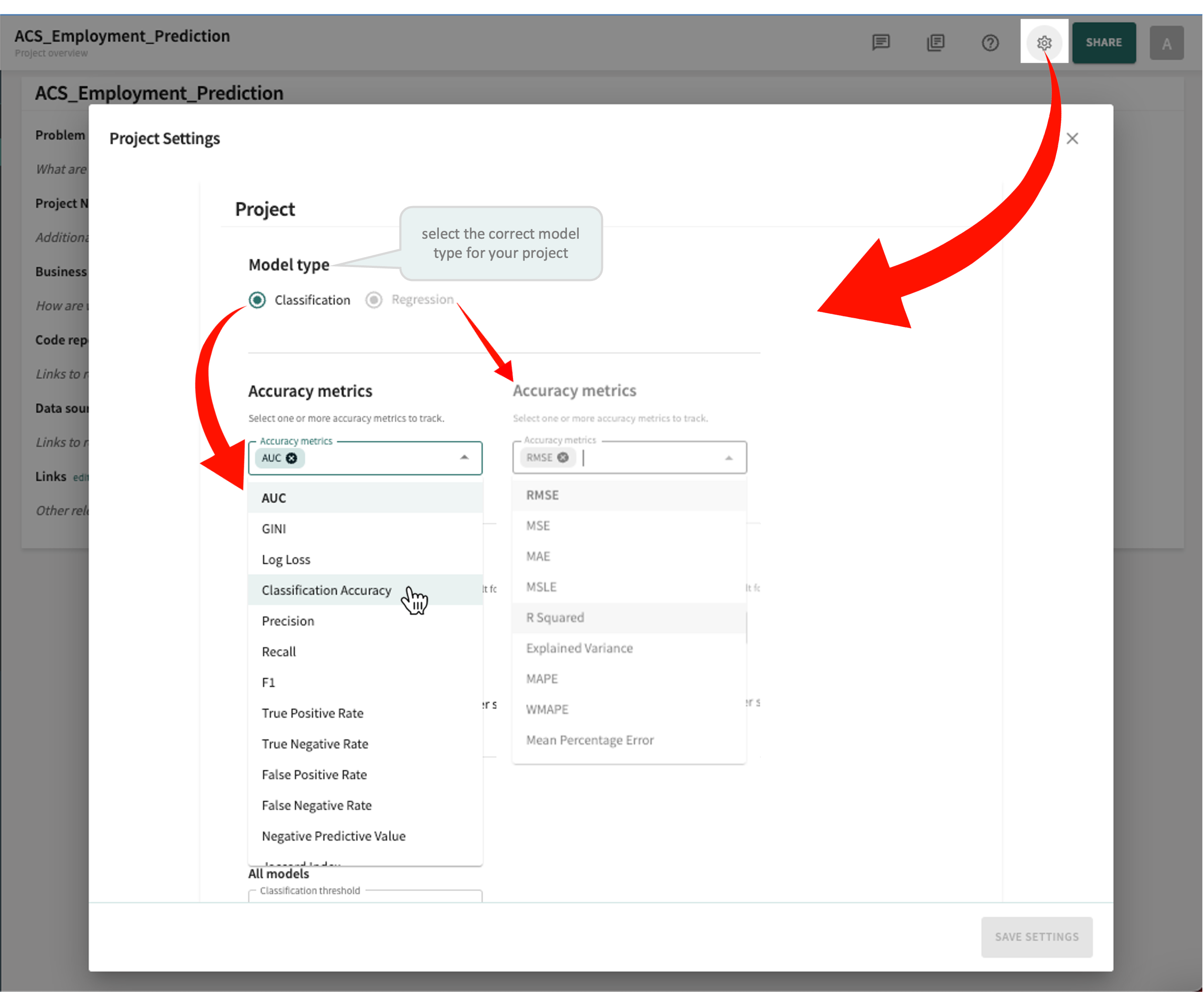
Performance Metrics
The Performance metrics panel in the top-right of the display scores each selected model for the data splits chosen (Evaluation vs. Baseline) based on the Accuracy metric set for the model (AUC in the example below).
Tip
- Click the Project Settings widget in the Web App toolbar.
- Select the correct Model type for your project.
- Select/deselect the Accuracy metrics you want to apply.
- Click SAVE SETTINGS.
Descriptions and examples of the performance measured under each tab for the resepctive model type (classification or regression) are provided next.
ROC Curve (classification models)
A classification model's ROC curve measures its true positive rate as a function of its false positive rate, which is created by varying the model threshold from 0 to 1. The area under the curve, or the AUC-ROC, is a threshold-independent metric that is at most 1.
If not already open, click the ROC CURVE tab in the bottom-left panel to see these results.
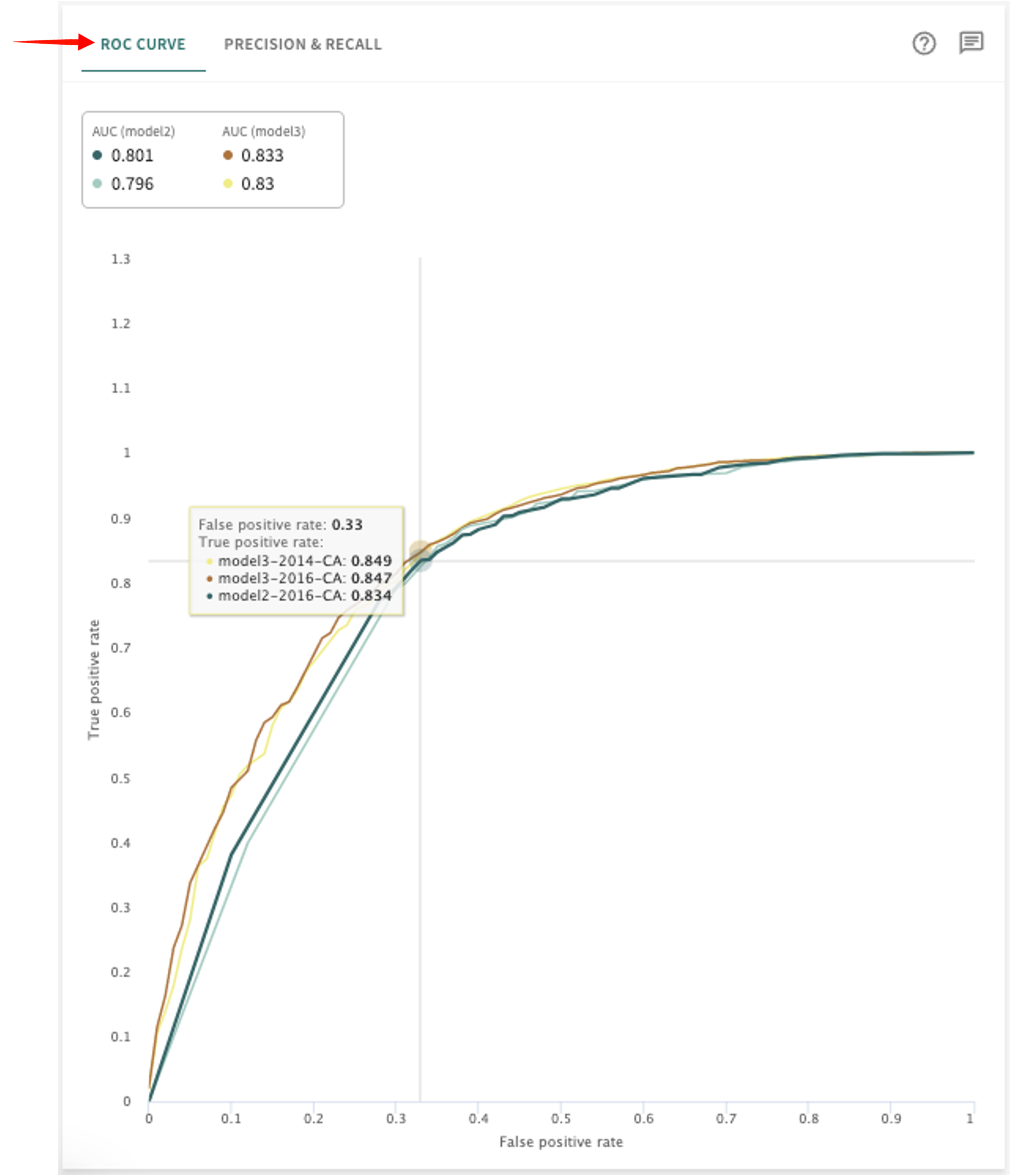
Hover over the plot to place the crosshairs at specific coordinates to see a data point's false positive and true positive rate in each model selected.
Precision-Recall Curve (classification models)
The Precision-Recall curve plots the precision of a classification model as a function of its recall, which is created by varying the model threshold from 0 to 1. Each point on the curve represents a unique precision and recall that can be achieved by the model and shows the tradeoff between precision and recall for different thresholds. A high area under the curve represents both high recall and high precision, where high precision relates to a low false positive rate and high recall relates to a low false negative rate.
Click the PRECISION & RECALL tab to see these results.
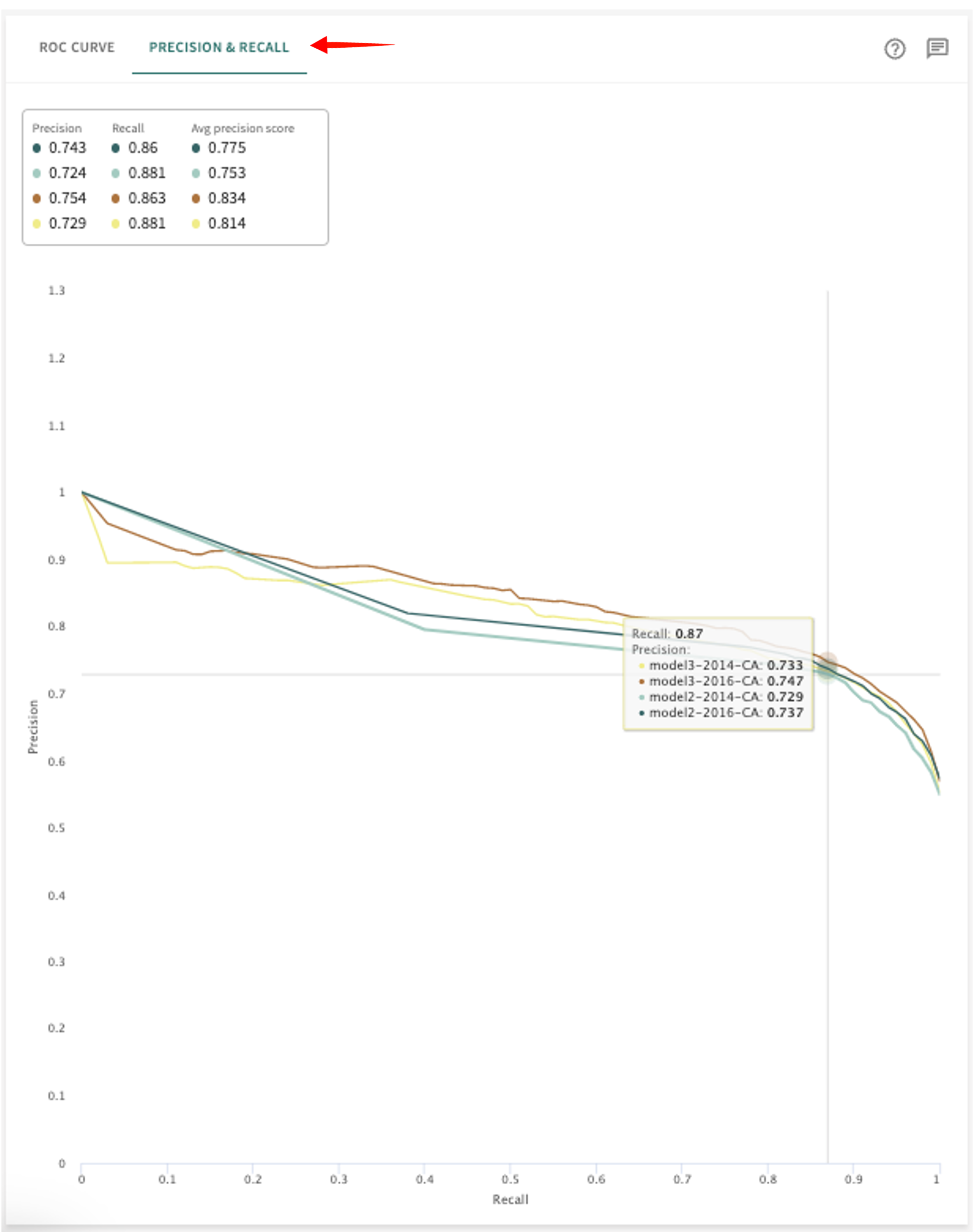
Hover over the plot to place the crosshairs at specific coordinates to see a data point's Recall and Precision rate in each model selected.
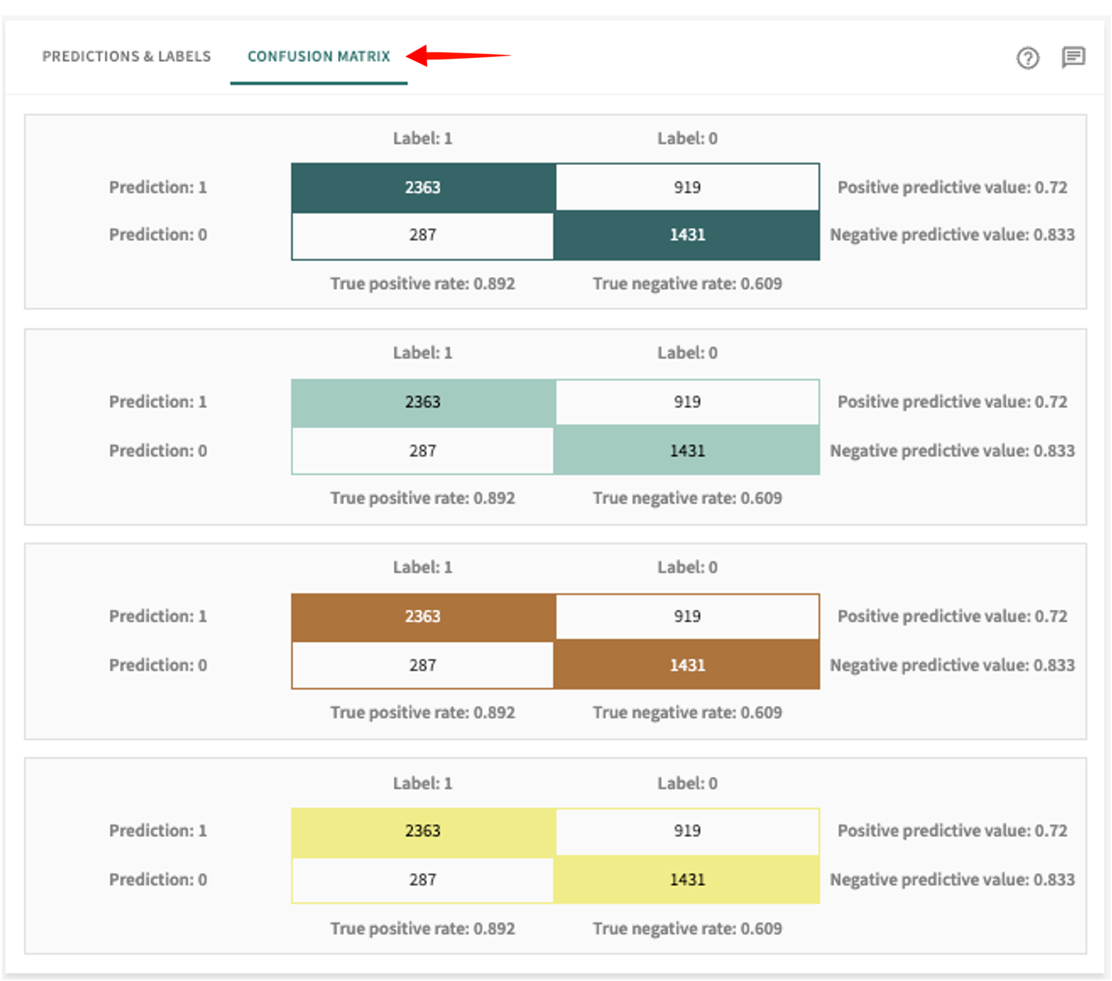
Predictions and Labels (classification models)
This tab displays the Total points in each Data split, along with the difference (actual vs. predicted) between ground truth classes Label 0 (below the threshold) and Label 1 (above the threshold) versus Prediction 1 and Prediction 0 reflect the ratio of data points the model (or models being compared) assigned to the respective class.
Click the PREDICTIONS & LABELS tab in the panel on the right to see these results.
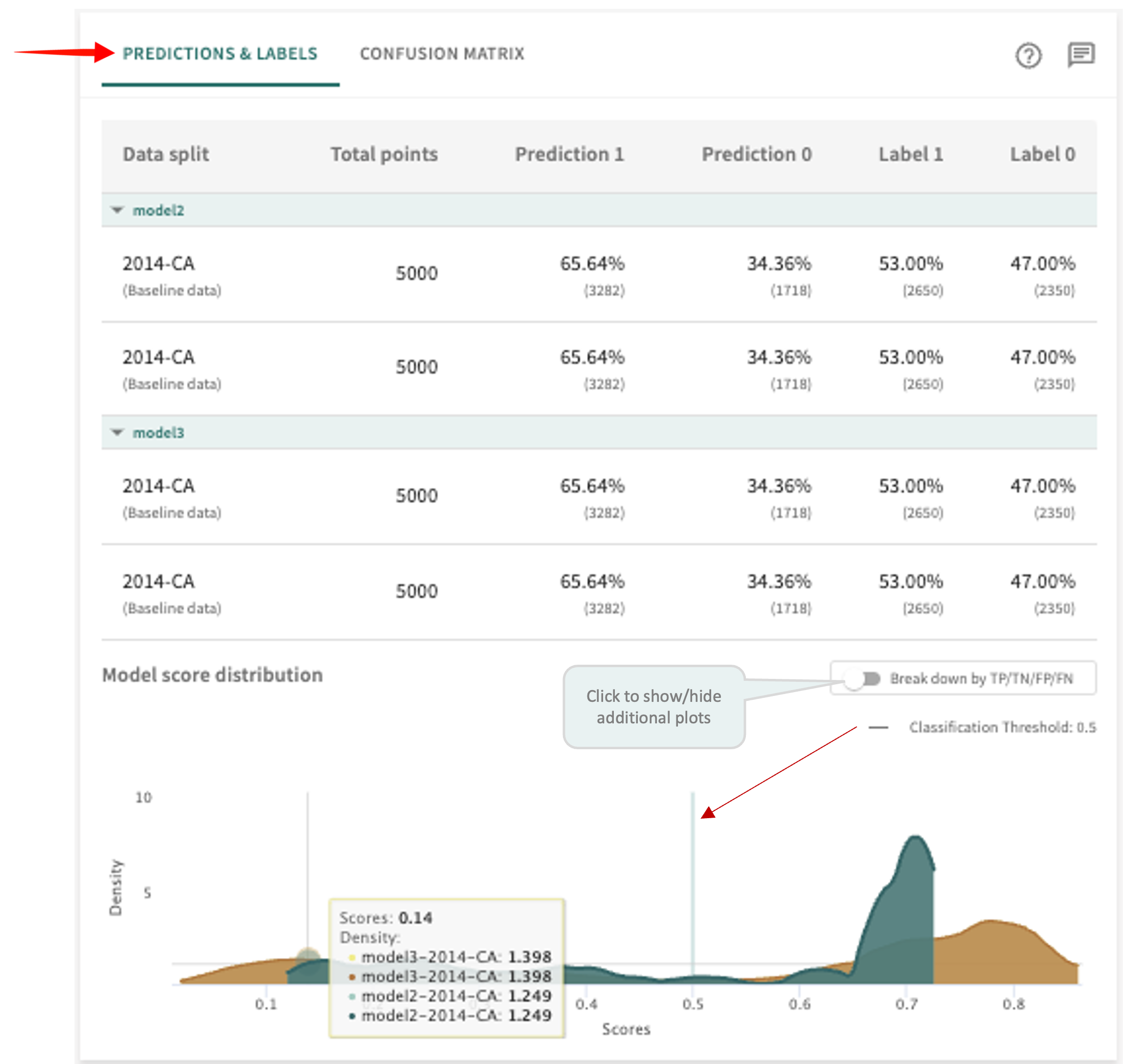
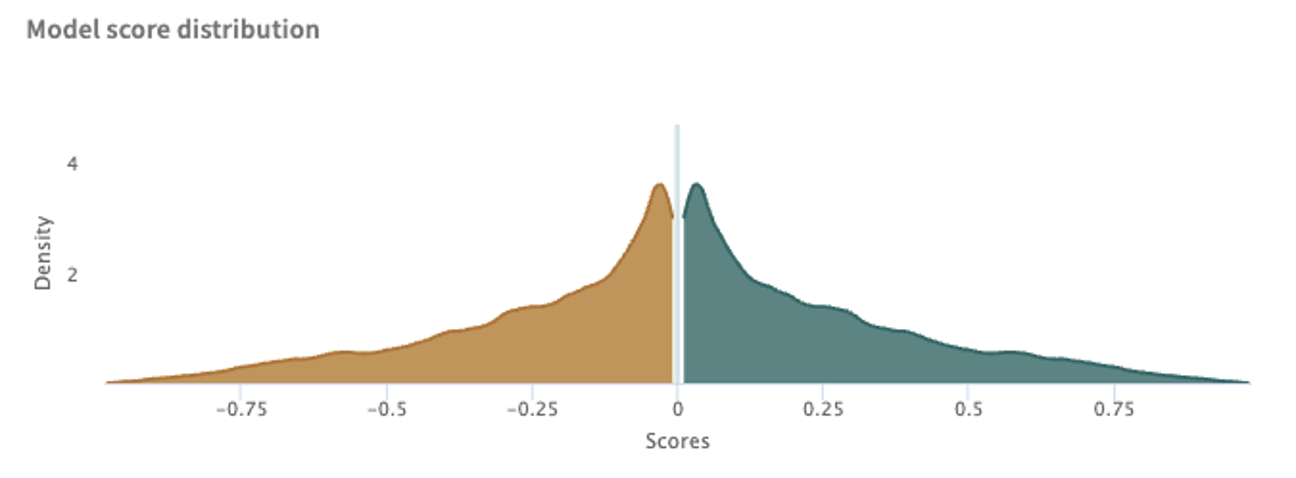
The Model score distribution plot graphs the distribution of scores for all points, filtered by the ground truth label. This can give you information about whether the model predictions are skewed to extremes or concentrated near the classification threshold, denoted by the vertical line.
Click the Break down by TP/TN/FP/FN toggle switch to show/hide more granular plots of true positive, true negative, false positive and false negative scores.
Confusion Matrix (classification models)
A Confusion Matrix measures the performance of classification models for which the output can be two or more classes. The matrix is a table with four different combinations of predicted and actual values, where predicted values are either positive or negative and actual values are either true or false, such that:
- True positive means the predicted value is positive, which is actually true.
- True negative means the predicted value is negative, which is actually true.
- False positive means the predicted value is postive, which is actually false.
- False negative means the predicted value is negative, which is actually false.
Values at the bottom of the matrix indicate the aggregate true positive/negative rate. Values to the right of the matrix indicate the aggregate positive/negative predictive value.
Predicitons and Labels (regression models)
TruEra uses error metrics specifically designed for evaluating predictions made on regression problems.
Click the PREDICTIONS & LABELS tab in the panel on the right to see these results.
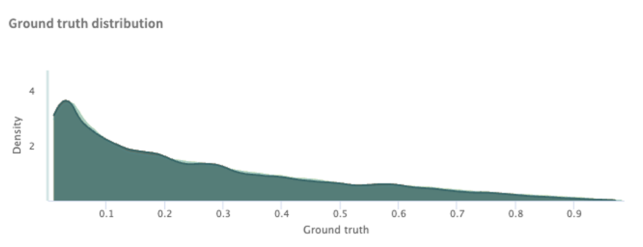
In regression analysis, it's important to remember that a label is the thing or value data scientists are trying to predict. Hence, for regression models, TruEra generates the following measurements:
Ground truth distribution – ground truth is the target for training and validating your model with a labeled dataset; i.e., actual/true results.
Model score distribution – shows the distribution of model scores for all points.
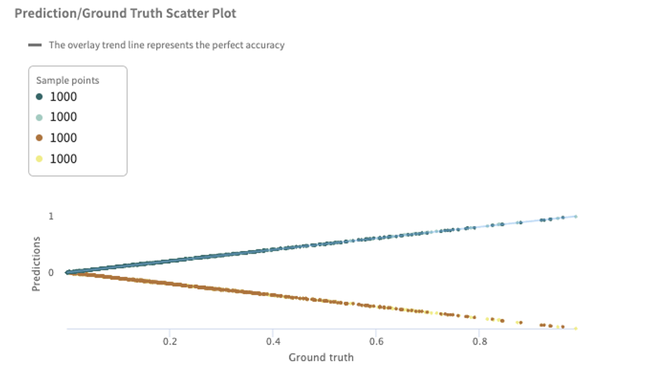
Prediction/Ground Truth Scatter Plot – used to visualize a model's under- or over-predicting on groups of points. The trend line of a perfectly accurate model (model predictions always equal ground truth) is shown in an overlay. Regression scatter plots can be used to characterize whether the model is under- or over-predicting on groups of points.
Focusing on Error Hotspots
When a model is processing high dimensional data, troubleshooting low performance input regions can be challenging. TruEra helps you focus on areas in which model performance is poor by automatically identifying error hotspots.
Click the Focus tab to view the TruEra-identified hotspots for the selected model and data.
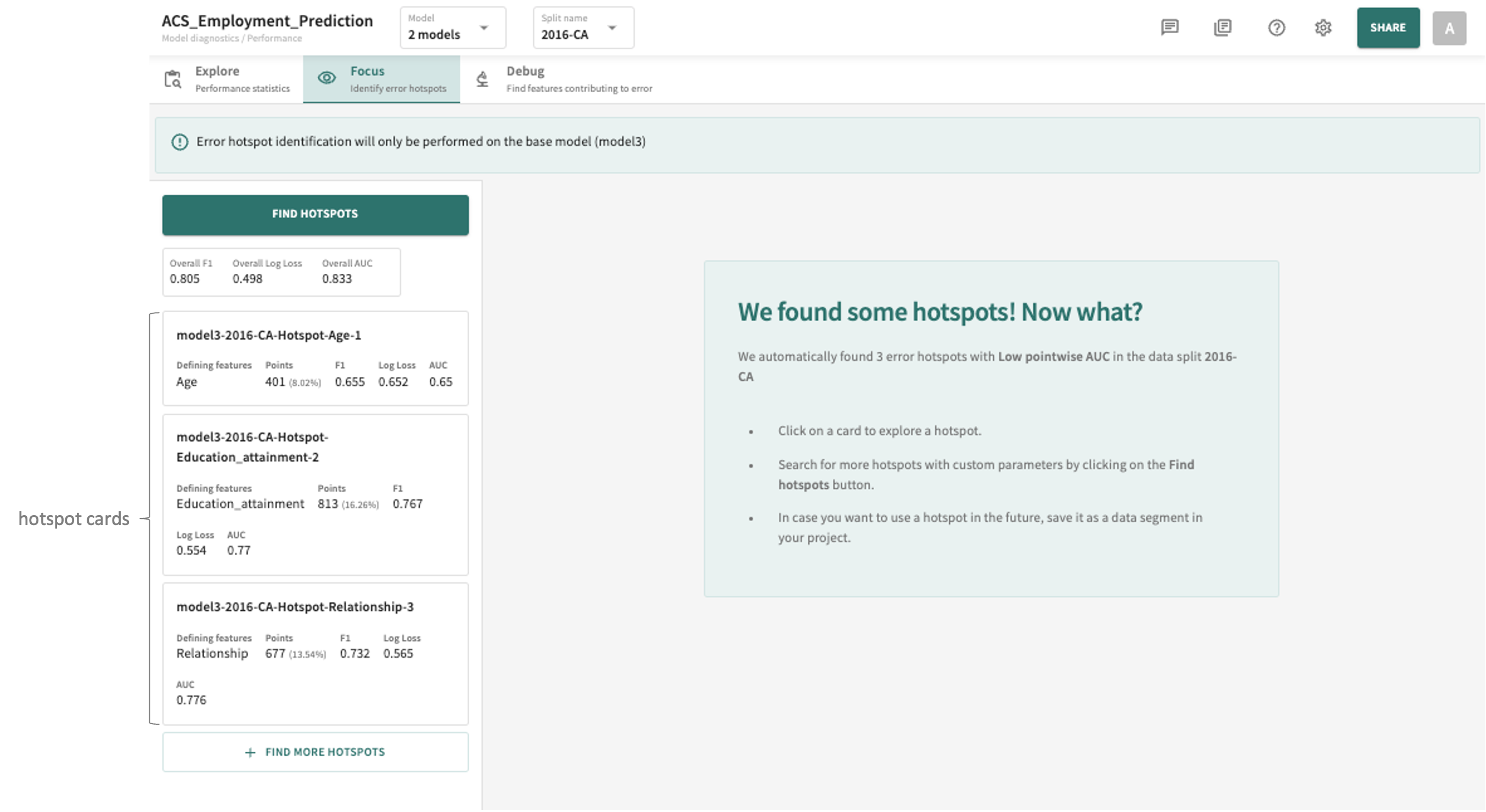
If hotspots are found, you'll see them listed on the left, organized by defining features and sorted by the degree of deviation/difference from the rest of the population.
Feature Data and/or Error Influences Missing?
If feature data is missing from the selected split, you'll see the following message:
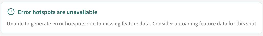
As indicated, once you successfully upload feature data for the split using the SDK's add_data() method, specifying feature_influence_column_names in column_spec, TruEra should then be able to automatically generate error hotspots, presuming they exist for the split.
If you subsequently need to add error influences, use the SDK's add_model_error_influences() method to upload error_influence_data and score_type.
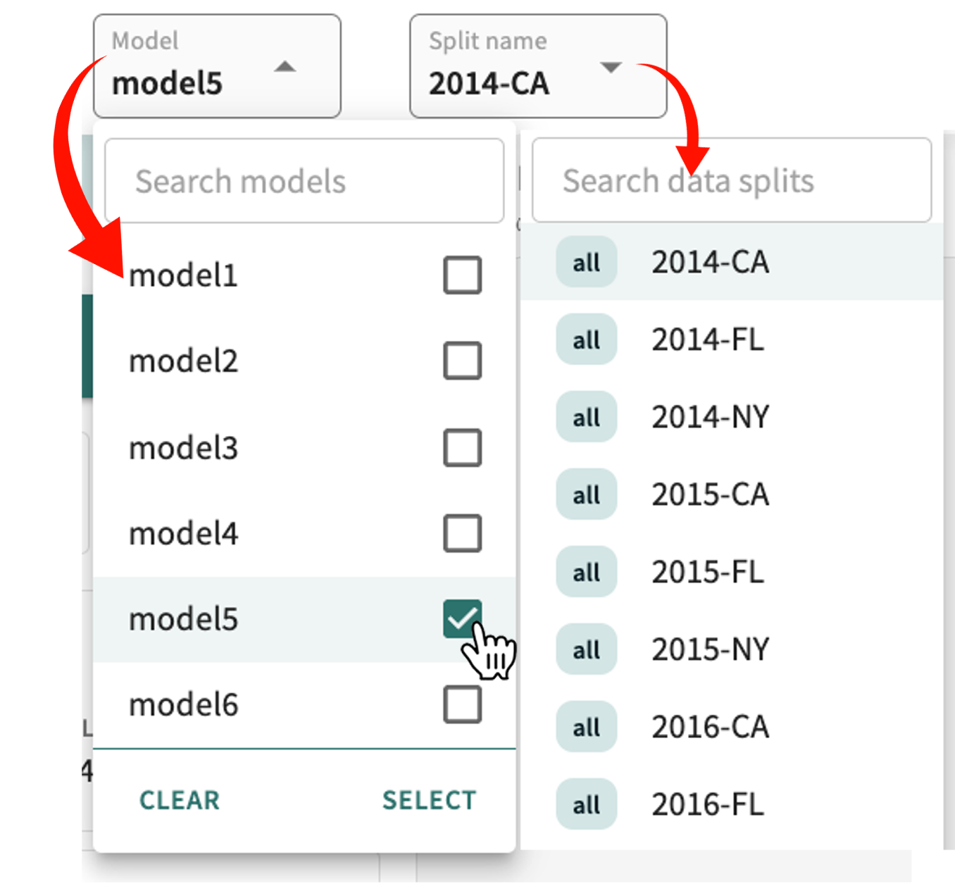
You can select a different model and/or split at any time.
- Click the Model selector.
- Deselect the currently selected model(s), then select the desired model(s).
- Click SELECT.
- Click the Split name selector.
- Select the desired split.
Search for a model or split by entering a parial or full string in the respective search box.
Click a hotspot card to view its details.
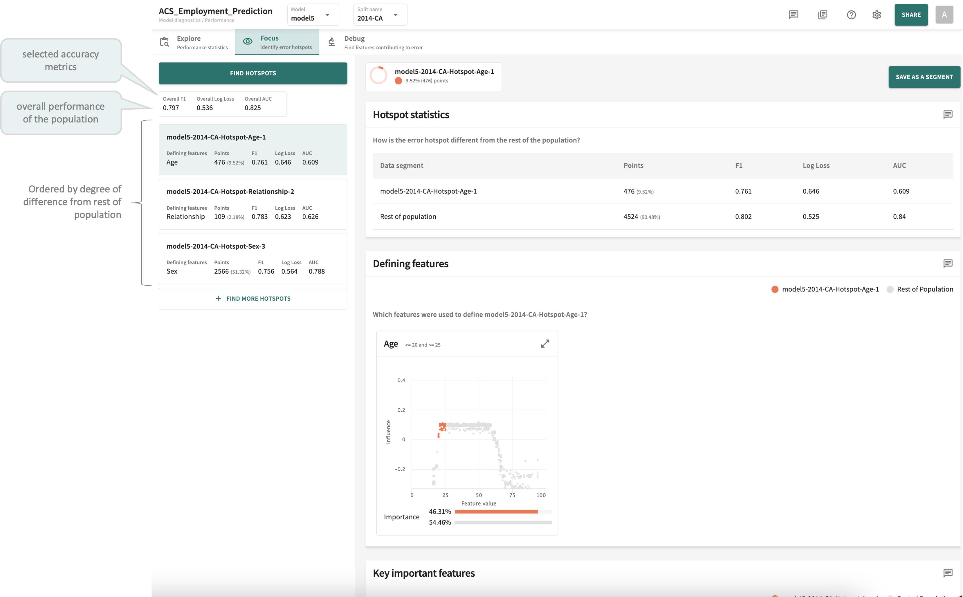
As shown in the example above, the details for each hotspot are arranged in three panels:
-
Hotspot statistics – how this error hotspot is different from the rest of the population with respect to each of the Accuracy metrics currently defined.
-
Defining features – those features that define this hotspot segment, exposing the divergence of these data points from the normal (or trend) associated with the rest of the population.
-
Key important features – the most important features influencing this hotspot segment.
Let's take a brief look at each one.
Hotspot Statistics
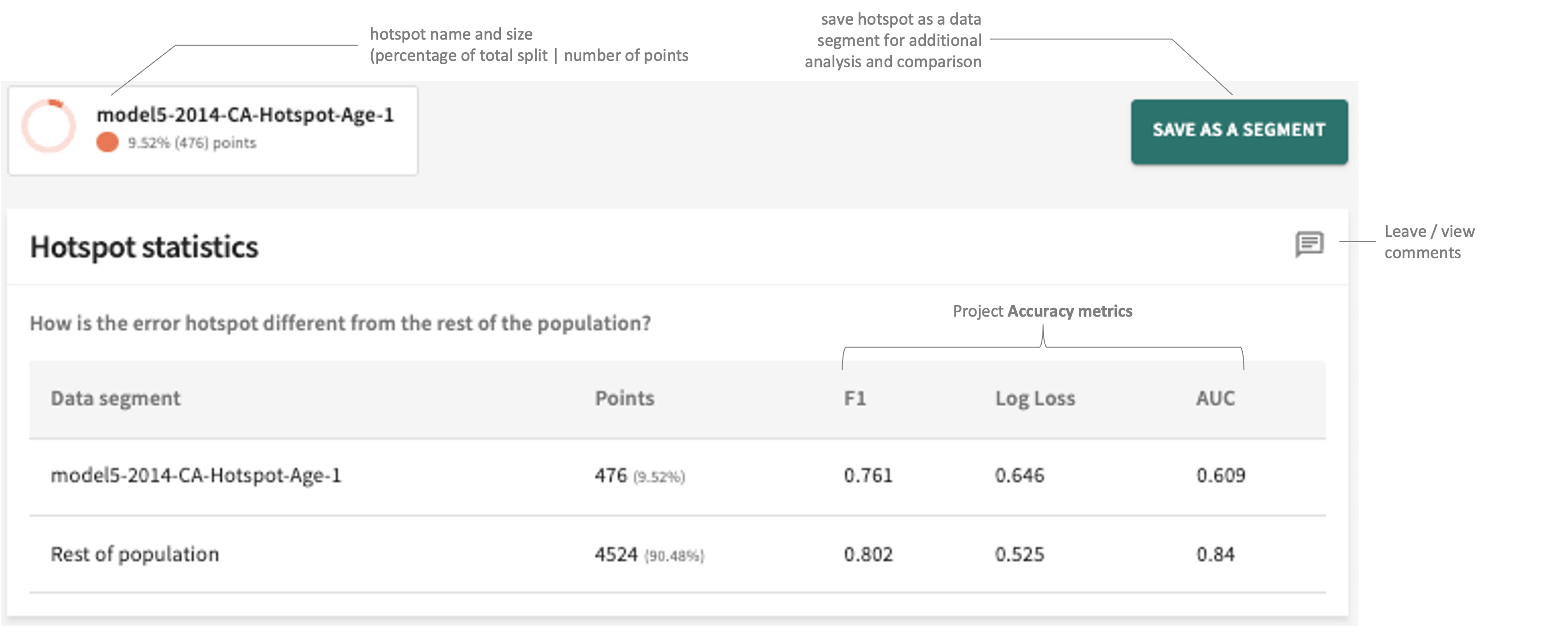
Illustrated above, you can capture and save the hotspot for later use as a segment. You can also leave pertinent comments/notes about these hotspot statistics for yourself and other project collaborators.
Defining Features
As a complement to the statistical analysis in the first panel, Defining features is a visualisation method to help you more readily notice problems identified by the hotspot.
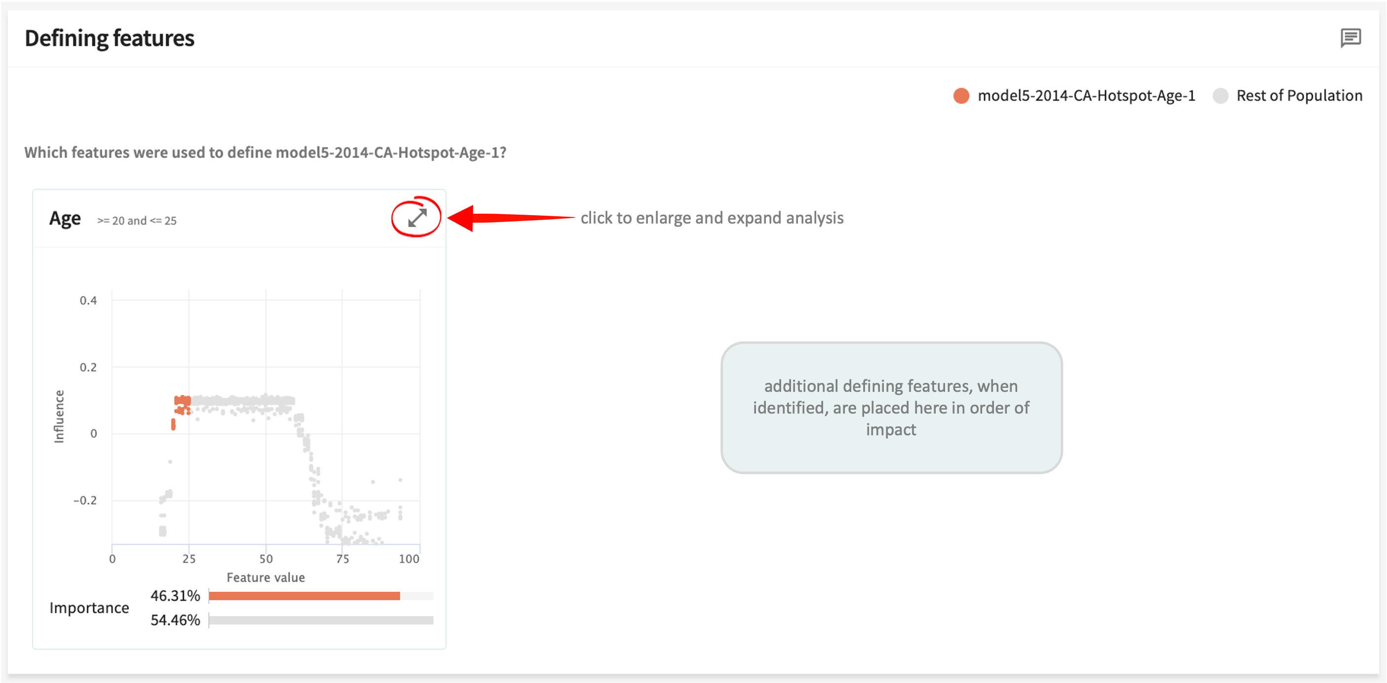
As indicated above, when additional defining features for a hotspot are identified, they're placed adjacent in order of their impact on performance.
Feature development/engineering is the process of selecting, transforming, extracting, combining, and manipulating raw data to generate the desired variables (features) for improved analysis and predictive modeling — a crucial step in developing an accurate machine learning model.
The five steps described next should help to provide insights for your feature engineering decisions.
Step 1. Data Cleansing
The process of dealing with errors or inconsistencies, data cleansing involves identifying incorrect, missing, duplicated, and/or irrelevant data, then adding, deleting, replacing, or modifying it to remove outliers and incorrect values.
Cleansing is different from transformation (Step 2) in that cleaning removes data that doesn't belong in your dataset, whereas transformation converts the data's format or structure into something more model-usable.
Step 2. Data Transformation
This is the process of transforming the data from one layout to another without changing the meaning of the original data. Transformation processes are also referred to as data wrangling, or data munging, transforming and mapping data from one "raw" data form into another.
The three most effective techniques are:
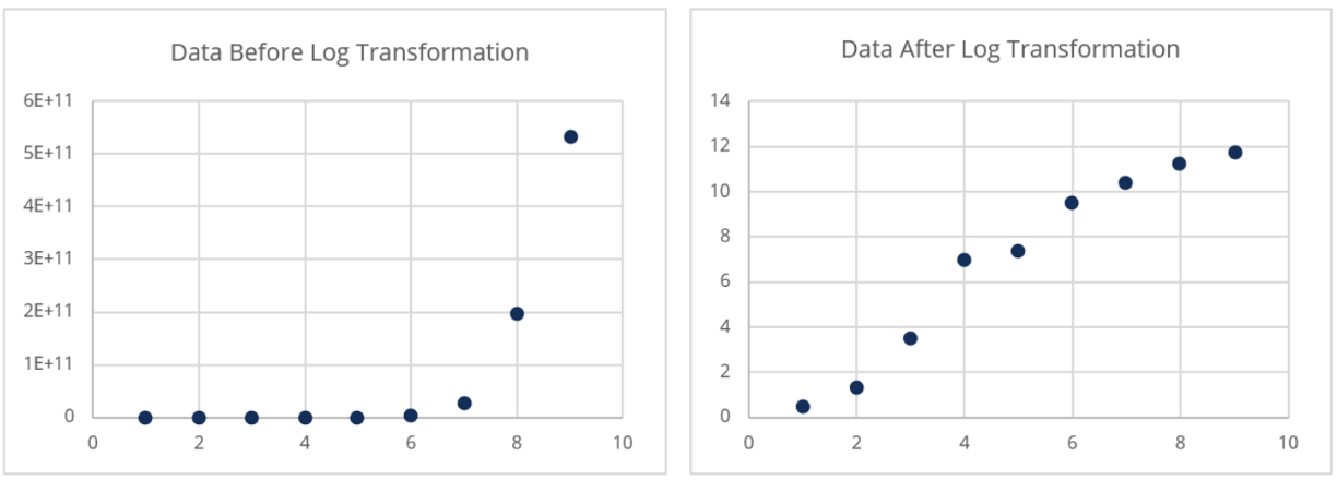
- Normalize – by applying a mathematical function to every data point to handle highly skewed data.
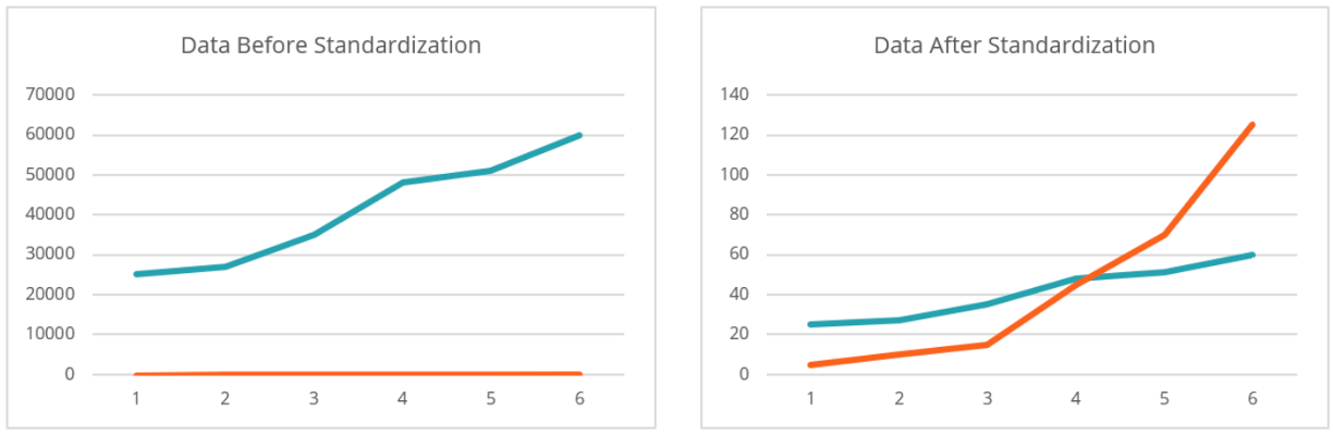
- Standardize – by converting the data to a uniform format as a way of handling data with differing units (e.g., converting US Custom and British Imperial measurements to metric).
- Encode – by converting categorical variables into numerical values so that they can be more easily fitted to the model.
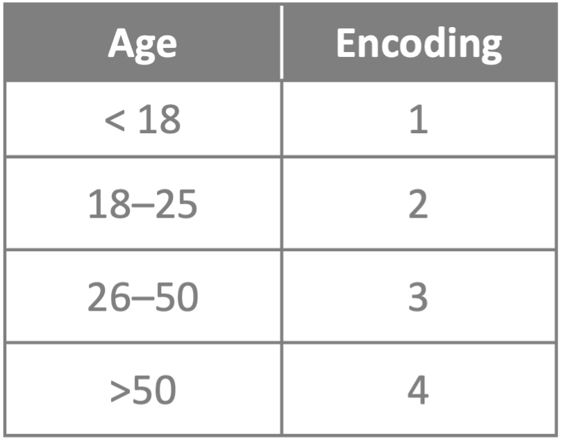
ML models require input and output variables to be numeric. Even so, the more simplified the encoding the better; i.e., encoding by shared/common characteristic(s) where feasible and meaningful.
Step 3. Feature Extraction
This is the process of extracting new features from the existing attributes to reduce the number of features in the model.
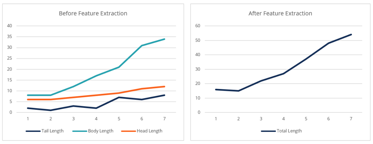
Feature extraction doesn't have to be complicated; it could simply entail grouping multiple variables into a feature that measures the average of those variables.
Step 4. Feature Selection
This involves selecting the correct subset of features to ensure capturing the closest relationship to the target variable; consists of eliminating features that do not explain the behavior of the target variable. Generally, this is done by ranking features based on a statistical test to identify the most important features.
Note: The third panel (Key important features) under the Focus tab will help you to rank feature importance. You can also use a correlation matrix, eliminating predictor variables that correlate highly with other predictor variables.
Step 5. Feature Iteration
While several techniques and methodologies can work to iterate feature optimization, they all follow a similar framework to the one illustrated below — adding or removing only those features that improve model performance.
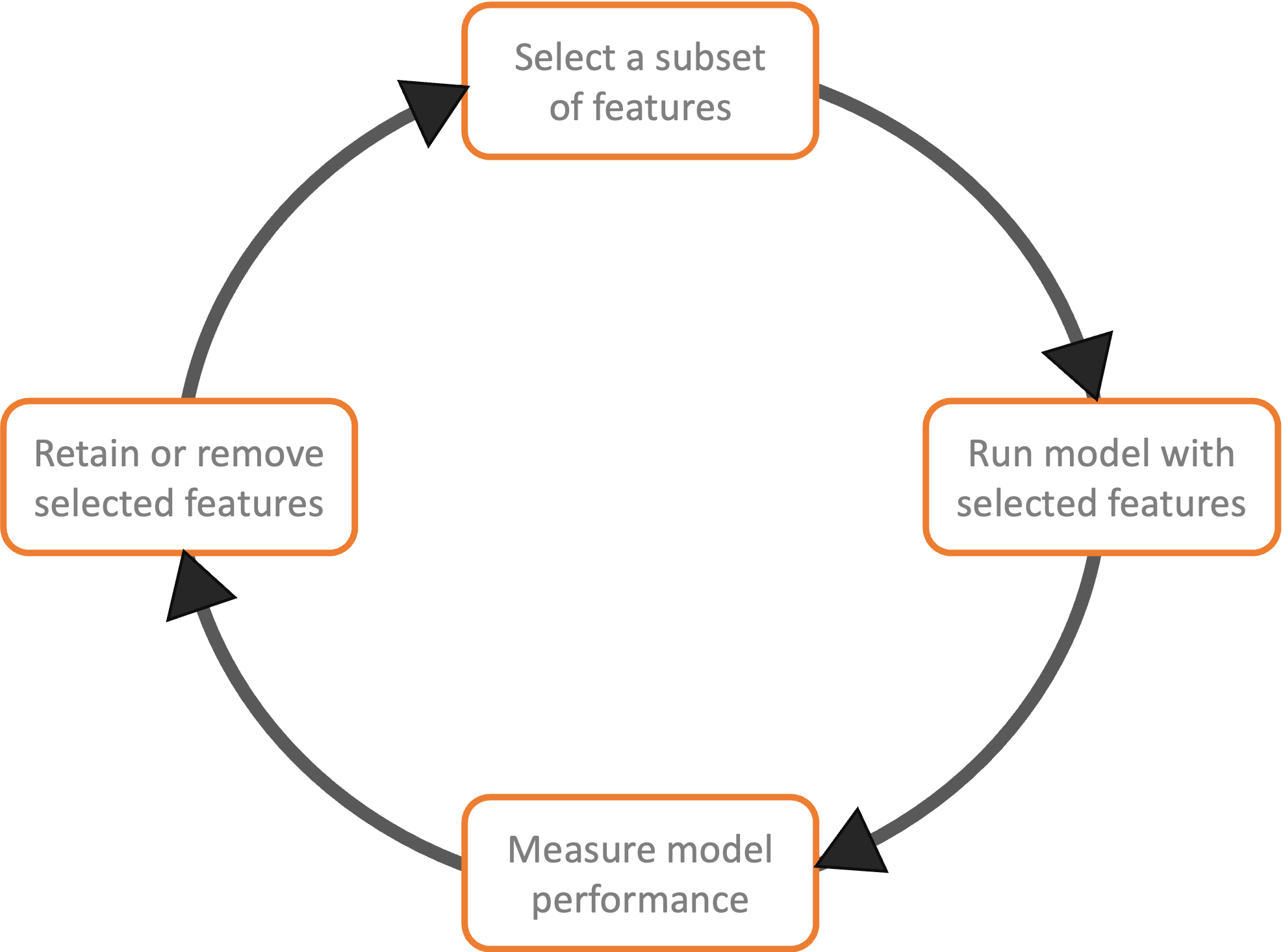
Hence, although there is no single correct way of optimizing features for maximizing model performance, the five steps discussed above should surface the necessary decision points leading to that objective; i.e., improved model performance.
Click the X at the top of this popup to close it and continue.
See Data Ingestion for more on ingesting transformed data after feature development.
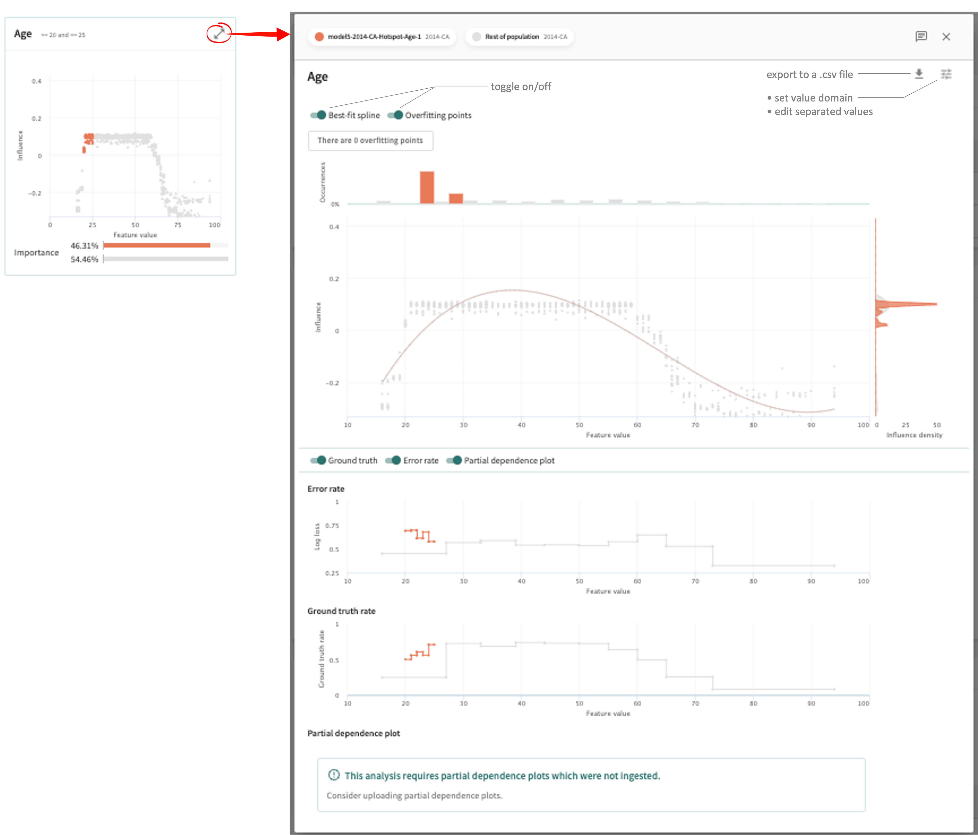
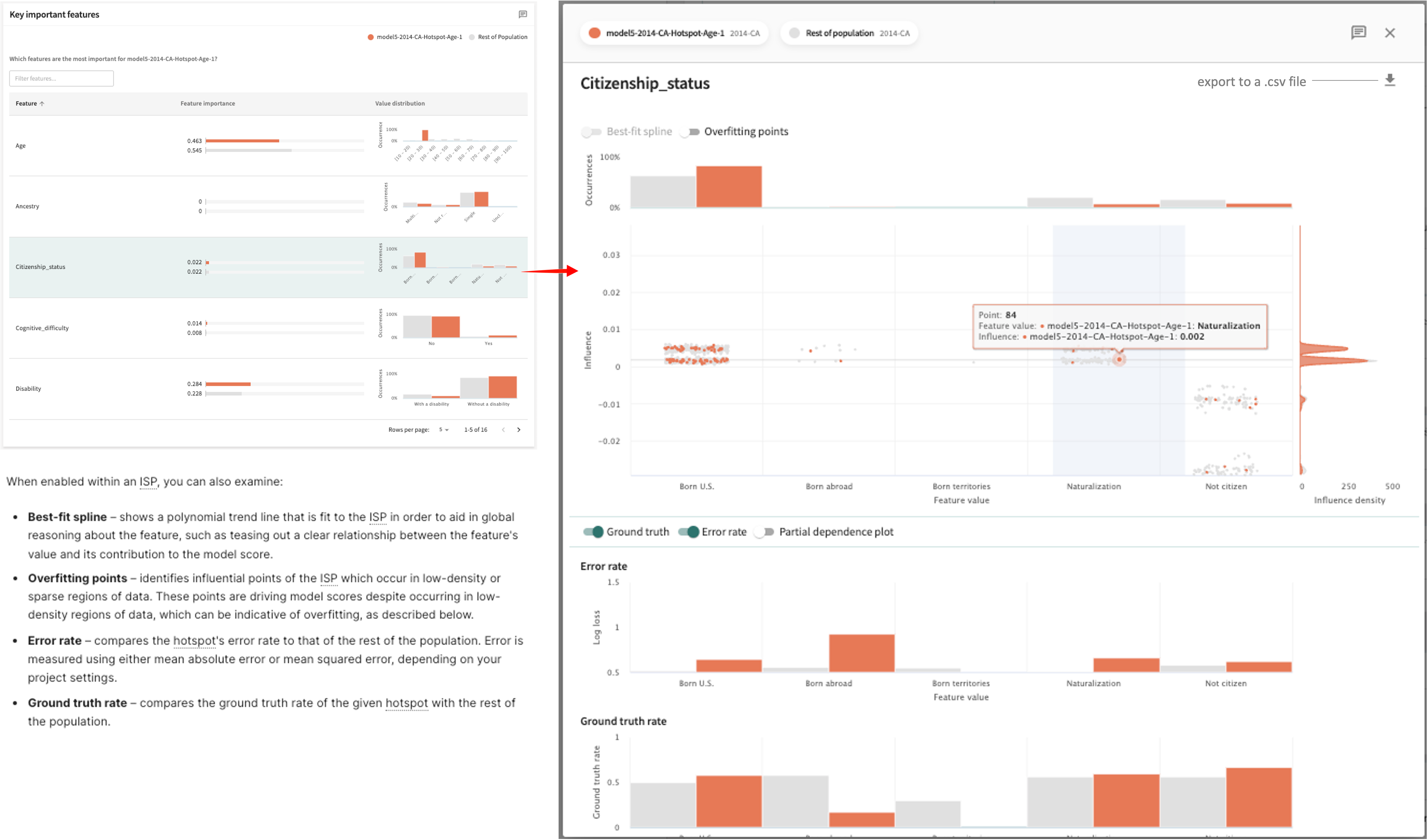
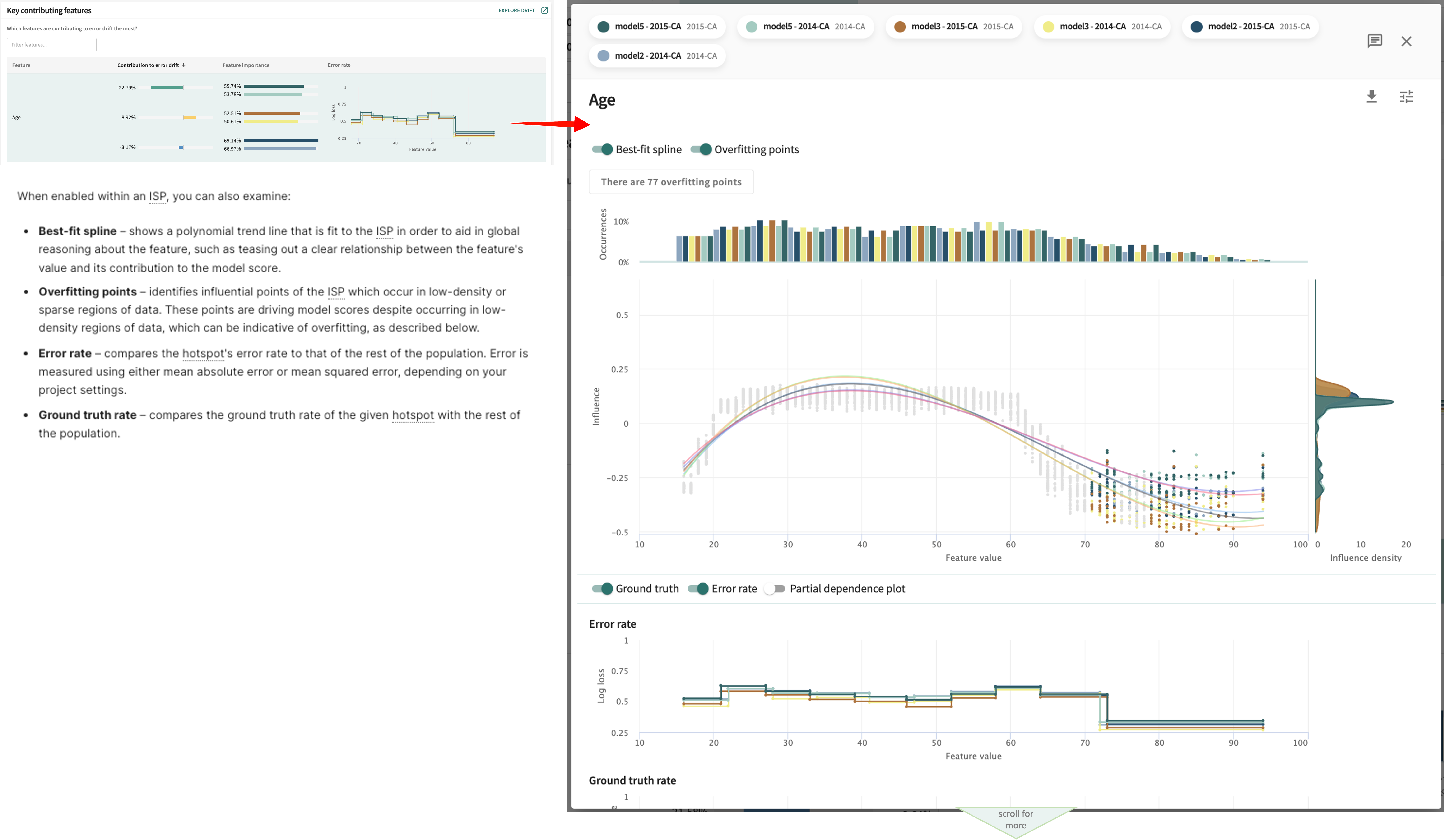
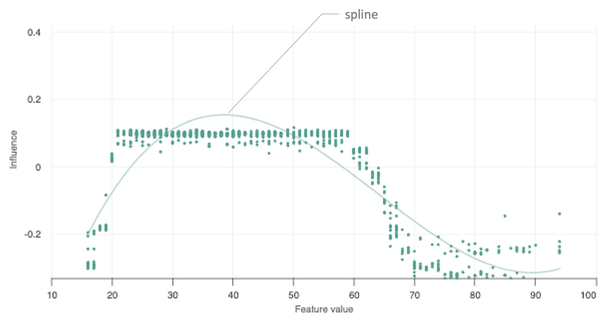
The overlay shows greater detail for this defining feature in the form of an Influence Sensitivity Plot (ISP). An ISP shows the relationship between a feature’s value and its contribution to model output, or its influence — a point-level visualization that allows you to examine the hotspot in detail. The number of Occurrences in the selected hotspot is graphed at the top and the Influence density is plotted on the right.
When enabled within an ISP, you can also examine:
- Best-fit spline – shows a polynomial trend line that is fit to the ISP in order to aid in global reasoning about the feature, such as teasing out a clear relationship between the feature's value and its contribution to the model score.
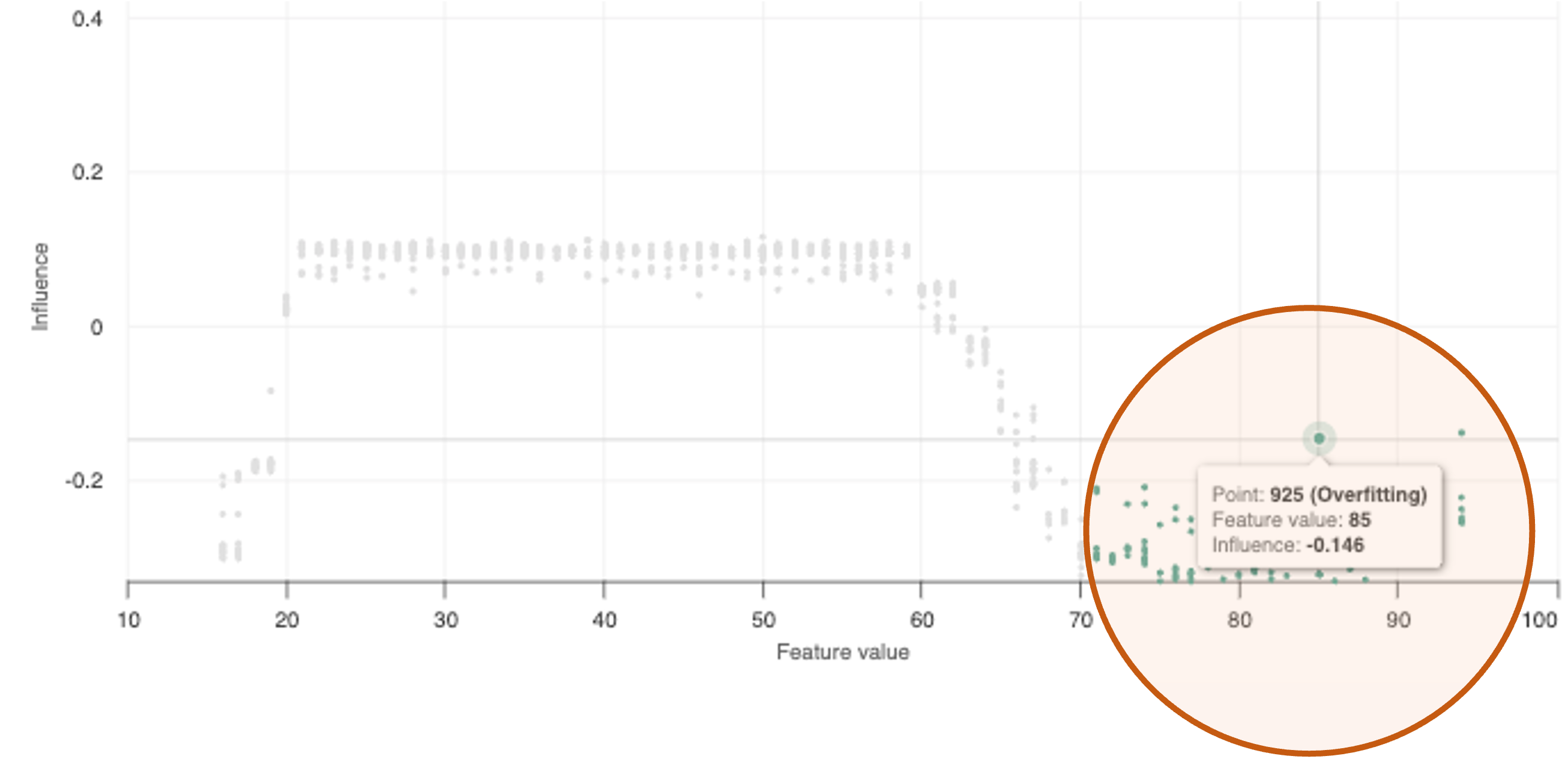
- Overfitting records – identifies influential points of the ISP which occur in low-density or sparse regions of data. These points are driving model scores despite occurring in low-density regions of data, which can be indicative of overfitting, calculated as described below.
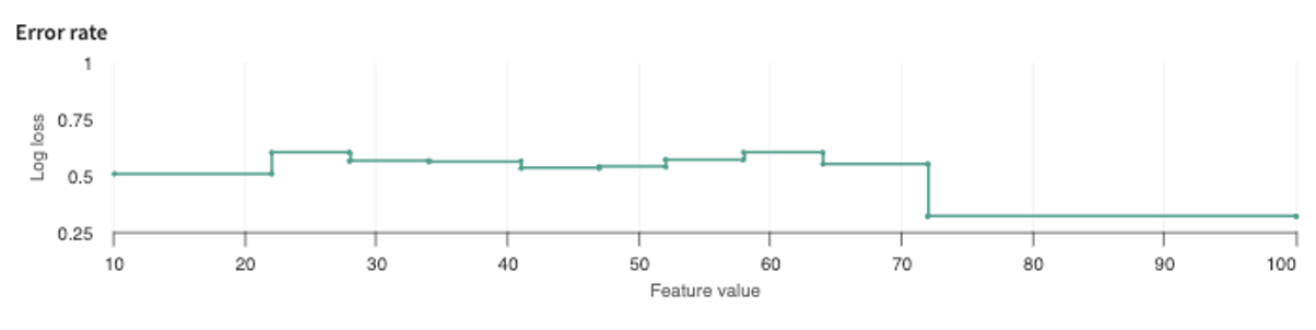
- Error rate – compares the hotspot's error rate to that of the rest of the population. Error is measured using either mean absolute error or mean squared error, depending on your project settings.
- Ground truth rate – compares the ground truth rate of the given hotspot with the rest of the population.
How is overfitting calculated?
The overfitting diagnostic identifies influential points which occur in low-density or sparse regions of data. Data points with feature values in regions with less than 3% of the data population and with influences at or above the 95th percentile are classified as overfitting. This indicates that the feature value of the point in question is driving a model's prediction, despite being a low-density region of data. If the model overfits on these low-density regions of data, it can fail to generalize, leading to poor test and production performance.
Click the X in the top-right of the hotspot detail overlay or anywhere outside of it to close it and return to the Focus tab.
Click SAVE AS A SEGMENT to keep this hotspot for future use and examination.
Key Important Features
This panel ranks each Feature in the selected split by Feature importance, although you can filter the list to only include particular features.
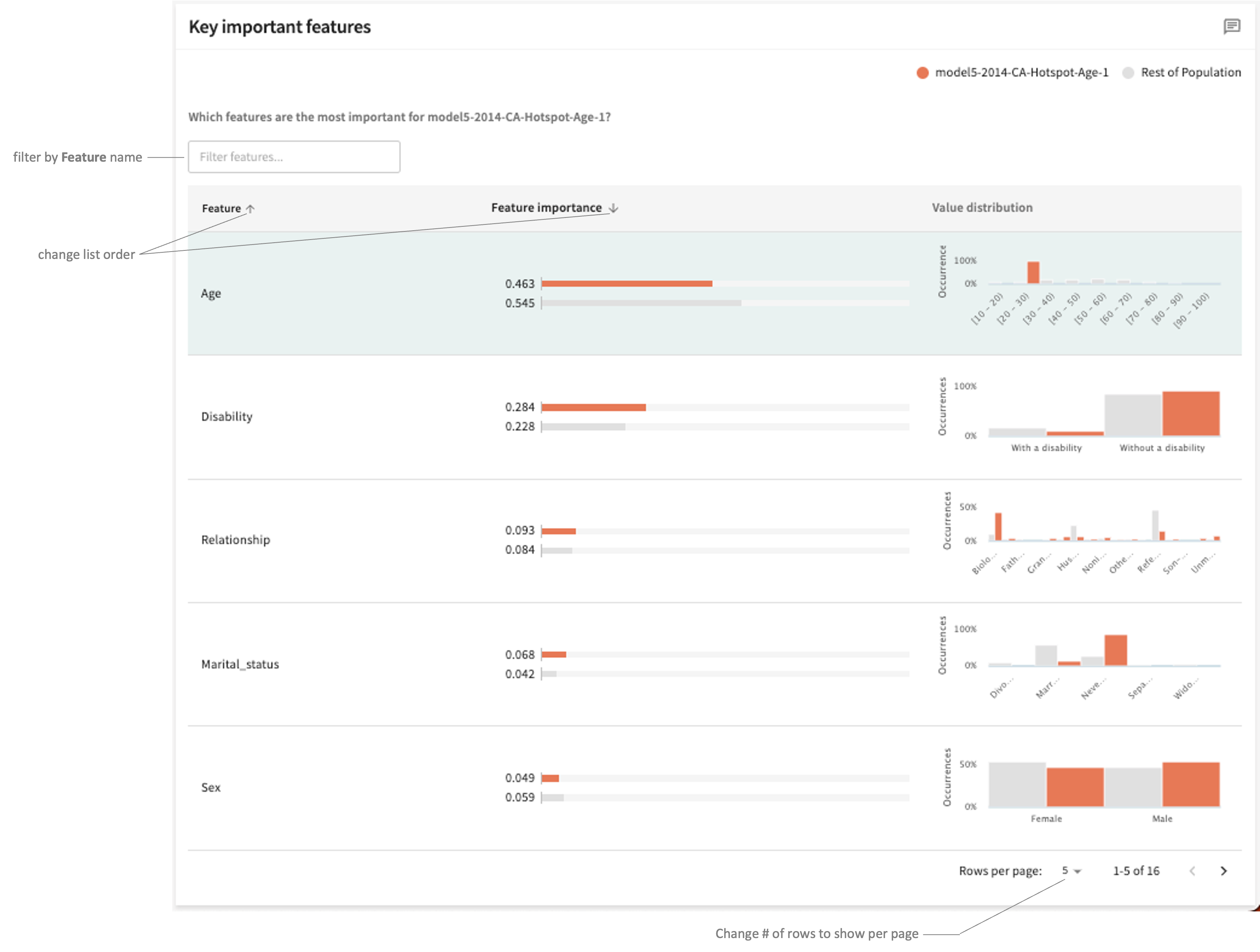
The initial table presents a summary level view each feature's importance and value distribution. You can sort the list in descending or ascending order of importance by clicking the down/up arrow ( / ) in the Feature importance column heading. Sort in ascending or descending order of Feature name by clicking / in the first column heading.
To see the ISP for a listed feature, click its row.
As with Defining features (second panel), the overlay contains an Influence Sensitivity Plot (ISP) showing the relationship between a feature’s value and its contribution to model output — its influence — a point-level visualization that allows you to examine in greater detail this feature's impact on the hotspot compared to its impact on the rest of the population. The number of Occurrences is graphed at the top and the Influence density is plotted on the right.
Click the ✕ at the top-right of the overlay to close it and return to the Focus tab.
Finding New Hotspots Using Different Parameters
Click the FIND HOTSPOTS button located at the top of the card list to change the current Parameters and Metric, then click FIND HOTSPOTS.
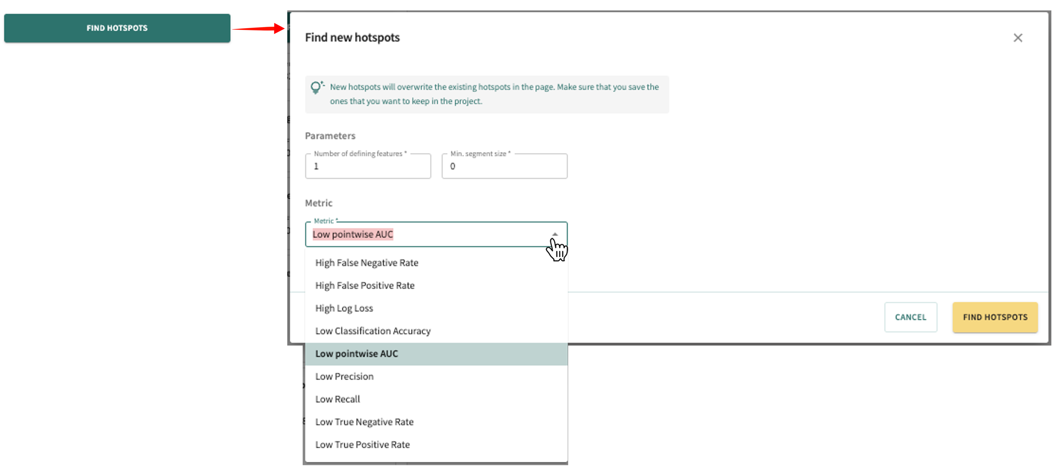
This replaces the current hotspot card list with new cards generated with the new settings.
Careful
As indicated on the Find new hotspots popup, new hotspots will overwrite existing cards on the page. Consequently, if you want to keep hotspots in your project, be sure to save them by first clicking the SAVE AS A SEGMENT button before generating new hotspots
Finding Features Contributing to Error Drift
The analysis you'll find under the Debug tab shows the error drift contribution made by your selected evaluation split — typically the test split — and the baseline split, which is usually the train split.
Note
The baseline is chosen automatically if the split name is specified during model ingestion.
This lets you see which features are causing the error difference between the two splits, helping you to zero-in on which features require further investigation.
Click the Debug tab to open it.
Selecting Models, Splits, and Filters
Narrowing your focus into those areas contributing the most to error drift will help to avoid a scattershot appoach to model/data debugging and performance improvement.
To determine which features are contributing the most to error drift:
- Select the model(s) and evaluation (test) split you want to compare.
- Select/confirm the Baseline data split.
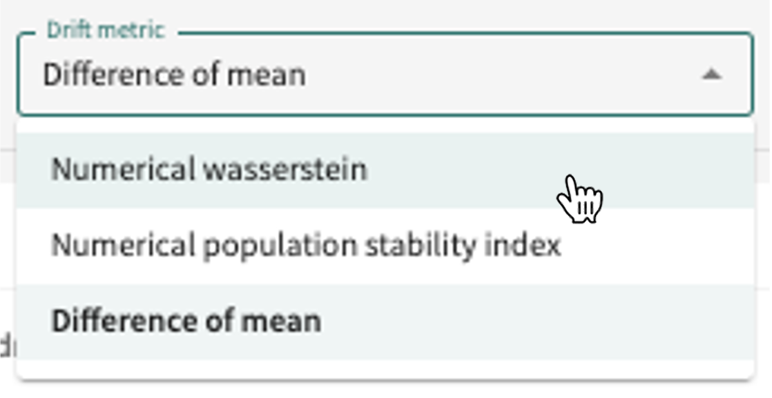
- Select the Drift metric to apply (see Drift Metrics for definitions of supported metrics).
- Filter by desired Segments, Classes and Labels.
- Click the Drift metric selector.
- Select the desired metric.
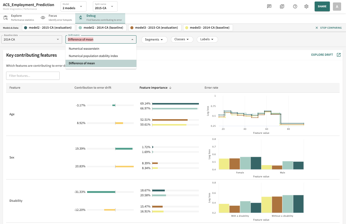
Initially, you'll see a summary table listing the Key contributing features to error drift for the selected models and data organized by Feature, Contribution to error drift, Feature importance, and Error rate. Click or to toggle a column's sort direction in according to the selected sort criteria (model and split) as pictured next.
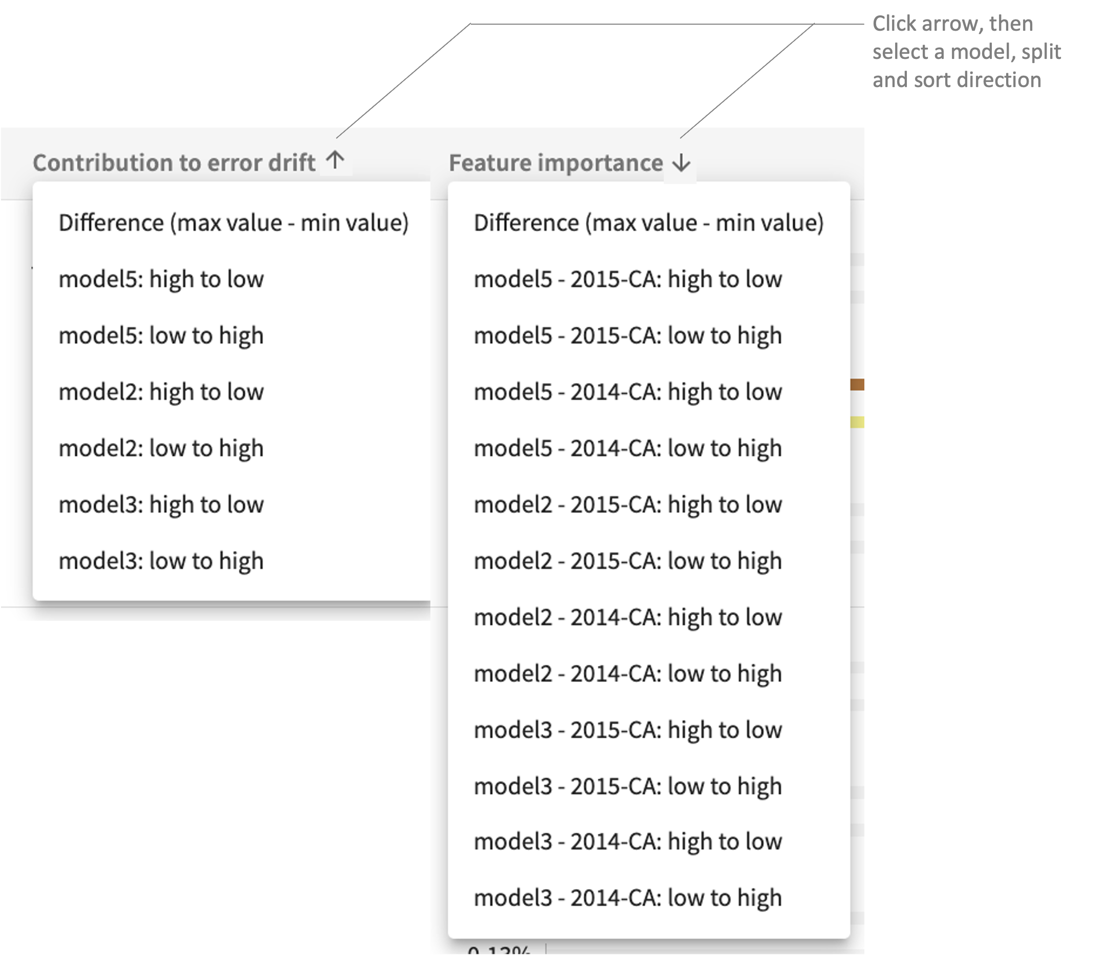
Bear in mind that the Feature column can only be sorted up/down by feature name.
Diving Deeper Into Error Drift Contributions
Next, you can further examine each Key contributing feature by taking a look at the associated ISP for the feature and its log loss error rate versus ground truth. Just click a feature row in the table to view these additional details.
To see an expanded drift analysis for the selected models that includes MSI, performance comparison and drift comparison with feature by feature score drift contribution and feature value drift contribution, along with the contribution to error drift accessed here, click EXPLORE DRIFT on the Key contributing features page under the Debug tab. See Drift for additional guidance.
Click Next below to continue.
Features that affect or impact the outcome of your model more than other features, either positively or negatively, are said to have influence. The most obvious way to identify an "influential" feature is to delete it from the model's training data. Should this produce signicant changes in model output, the deleted feature can safely be considered influential.
When a single datapoint is an outlier, it is called an "interesting" instance. An interesting instance can skew the influence of a feature.
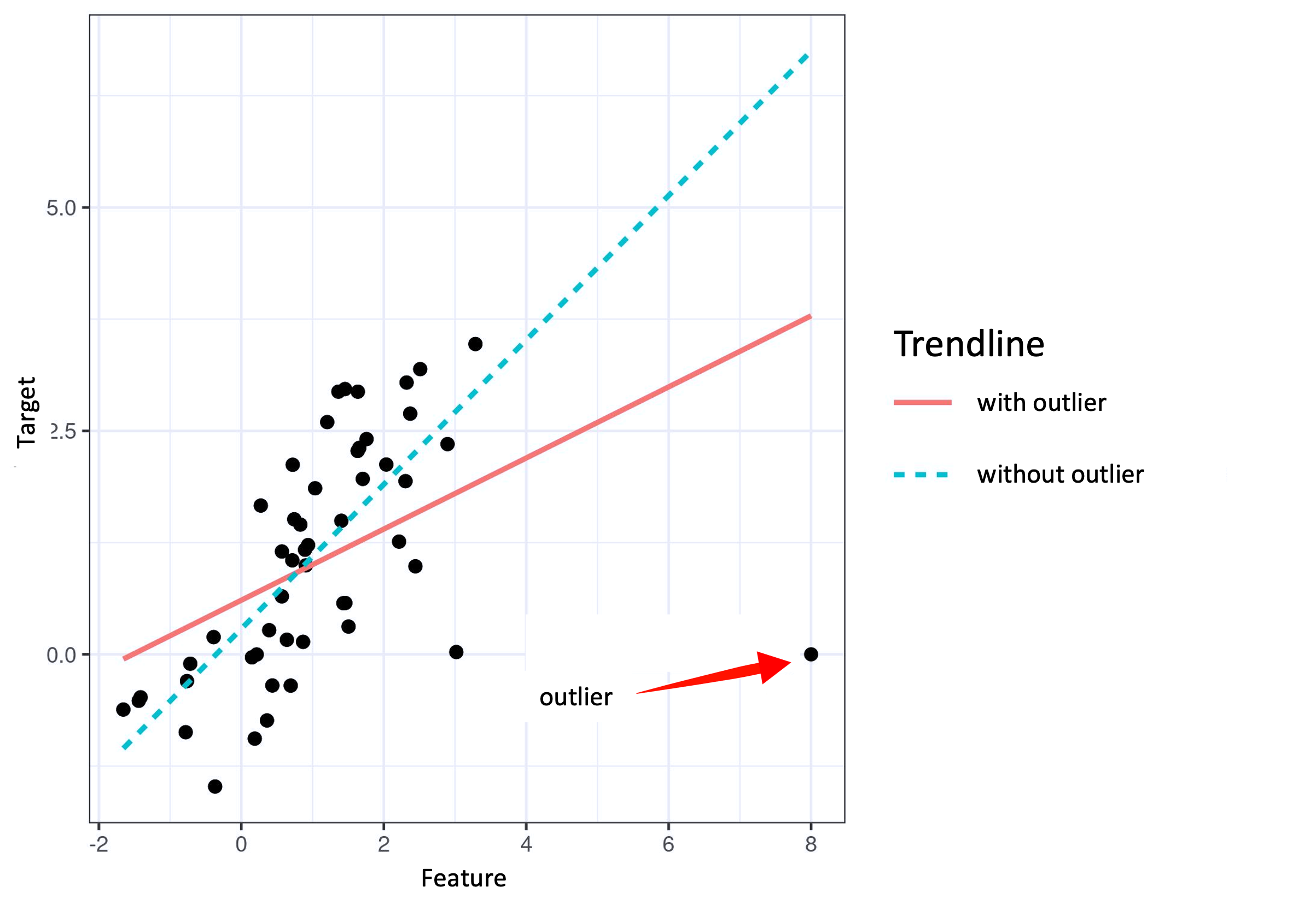
Hence, it follows that the more a model's parameters or predictions change when the model is retrained with the interesting instance removed, the more influential that instance is.
Curve fitting constructs a curve of the best fit to a series of data points. Interpolation is used to estimate the values of unknown data points that fall in between known (ingested) data points.
A spline is a piecewise polynomial parametric curve that minimizes a weighted combination of the average squared approximation error over observed data and the roughness measure. The term comes from the flexible (analog) spline devices used by shipbuilders and draftsmen to draw smooth shapes.
Essentially, spline interpolation fits low-degree polynomials to small subsets of points instead of fitting a single large-degree polynomial to all of them.
It is a generally preferred interpolation method because the interpolation error can be made small.
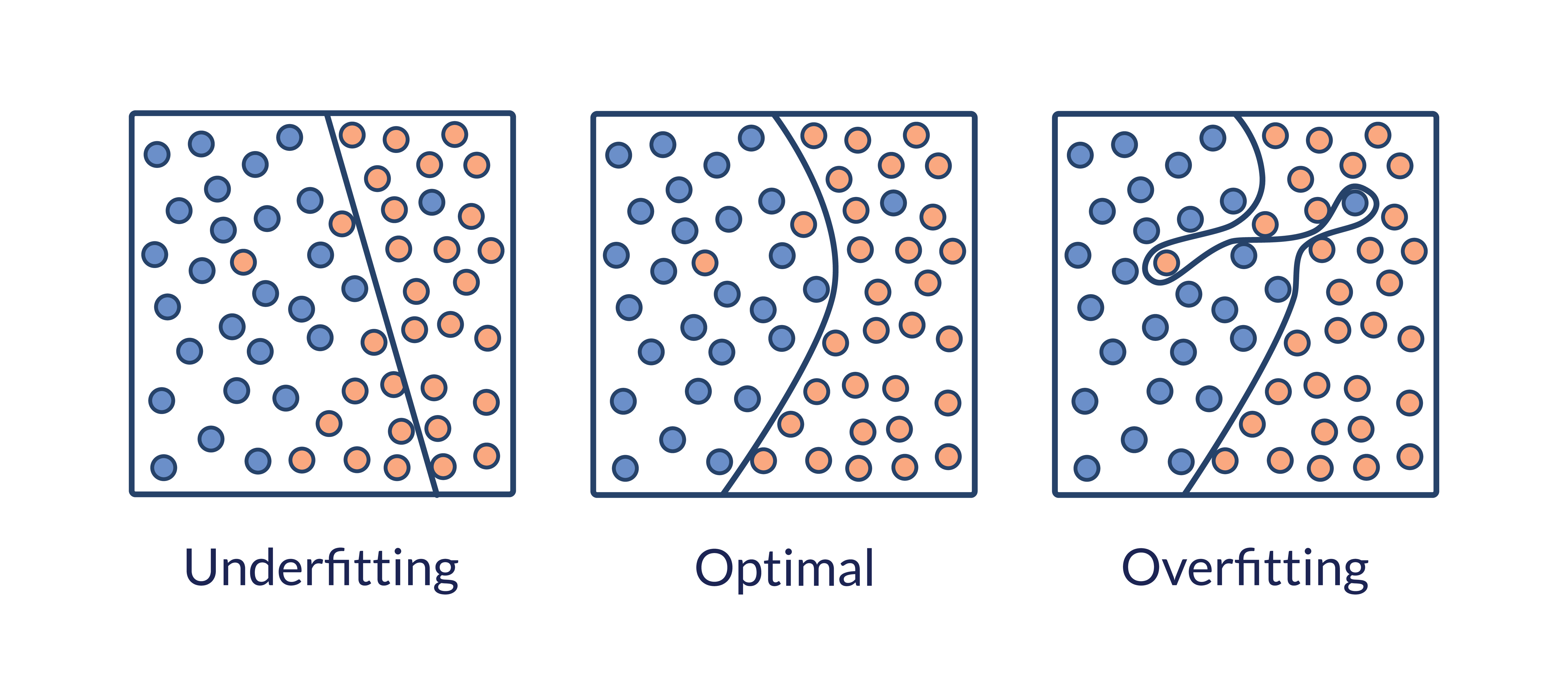
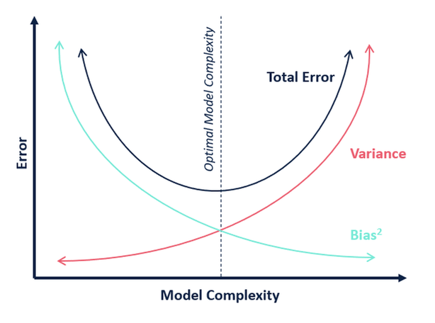
Overfitting occurs when the model fits exactly against its training data and cannot perform accurately against unseen data, defeating the purpose of machine learning.
More specifically, when the model trains for too long on sample data or when the model is too complex, it can start to learn “noise” (information that isn't relevant) within the dataset. When it memorizes the noise, fitting too closely to the training set, the model becomes “overfitted” — unable to generalize well to new data — making it unable to perform the classification or prediction tasks for which it is intended.
Generally speaking, low error rates and a high variance are good indicators of overfitting. To prevent this type of behavior, you should set up a test data split to check for overfitting. A training split with a low error rate and a test split with a high error rate signals overfitting.
How is the overfitting diagnostic calculated?
Data points with feature values in regions with less than 3% of the data population and with influences at or above the 95th percentile are classified as overfitting.
This indicates that the feature value of the point in question is driving the model's predictions, despite being in a low-density region of data. When the model overfits on these low-density regions of data, it is failing to generalize.
Model accuracy is the number of correctly predicted points out of all the data points modelled, whereas the error rate is a measure of how often your model classifies data incorrectly; in other words, the number of times it is wrong. More formally, model accuracy is defined as the number of true positives and true negative divided by the total number of true positives, true negatives, false positives and false negatives.

Error rate is calculated as the total number of two incorrect predictions (FN + FP) divided by the total number of data points (TP + TN + FP + FN).
Measuring model performance by quantifying the difference between predicted probabilities and actual values, Log loss (logarithmic loss or cross-entropy loss) is a common evaluation metric for binary classification models.
If the error rate of your model is very high — meaning the accuracy of its predictions are very low — then there is likely to be a lot you missed when fitting the model to the dataset you've chosen. Called "underfitting," this often occurs when your model:
- didn’t find any trend in the dataset
- is fitted to the wrong data; i.e., fitting a linear model to nonlinear data.
Otherwise, you can reduce underfitting by increasing the number of data points and reducing the number of superfluous (unecessary/redundant) features in the training split used.
At the other end of the error spectrum is "overfitting," which can happen when there are too many explanatory features selected.
Prevent overfitting by:
- Pausing training before your model starts learning noise — i.e., features unnecessary to the model's predictive purpose.
- Expanding the training split to include more data.
- Selecting features to include in the training data judiciously, identifying the most important ones, eliminating those that are irrelevant or redundant.
- Regularizing your model by applying L1 to feature selection (Lasso regression; shrinking coefficients to zero) or L2 (Ridge regression; shrinking coefficients equally) if features are collinear/codependent.
- Incorporating ensemble methods with a set of classifiers — e.g., decision trees that employ bagging and boosting.
Last but not least, check out this blog about the optimal error rate in model training.
Applicable to supervised algorithms, ground truth is the target for training and/or validating your model with a labeled (annotated) dataset — results already determined to be accurate; i.e., the "reality."
However, only model stakeholders can define the objective for the ground truth algorithm, which is almost always subjective, and on which decision-makers can disagree. Frankly, there are no hard-and-fast rules for defining ground truth labels. Nevertheless, the more high-quality labelled data you make available for training, the better your model will ultimately perform.
You should initially train your model on data with ground truth labels, evaluating it on test datasets for which the model doesn't know the ground truth label, then compare the model's predictions to the actual ground truth label to determine model performance.
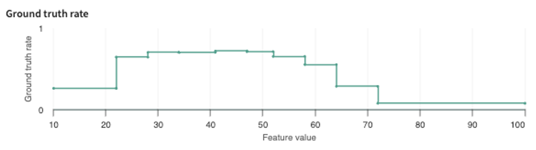
The ground truth rate plots the difference (loss/error) between the model's prediction and the ground truth, where ground-truth refers to the "officially correct" label (categorical or numerical) for a given input.
Partial Dependence Plots (PDPs) show you how a given feature affects the model's predictions, helping to extract valuable insights with respect to explainability you can relay to model stakeholders. For TruEra to display a feature's partial dependence plot, however, you must first ingest PDPs for the features you're most interested in analyzing for partial dependency.
To make a partial dependence plot with sklearn, for example, see the scikit-learn guidance, then use the Python SDK's get_partial_dependencies() method (see the Python SDK Technical Reference to ingest the PDPs.
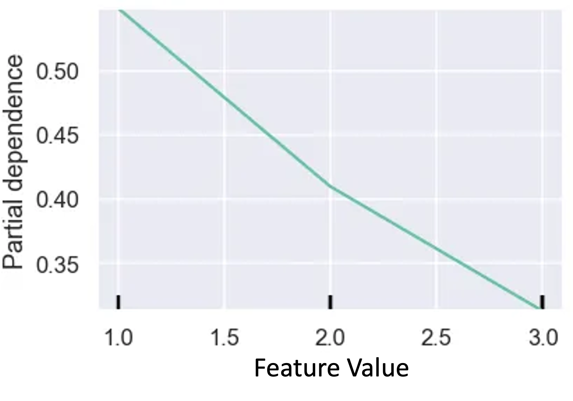
Essentially, PDPs plot the average affect on predictions as a particular feature value changes.